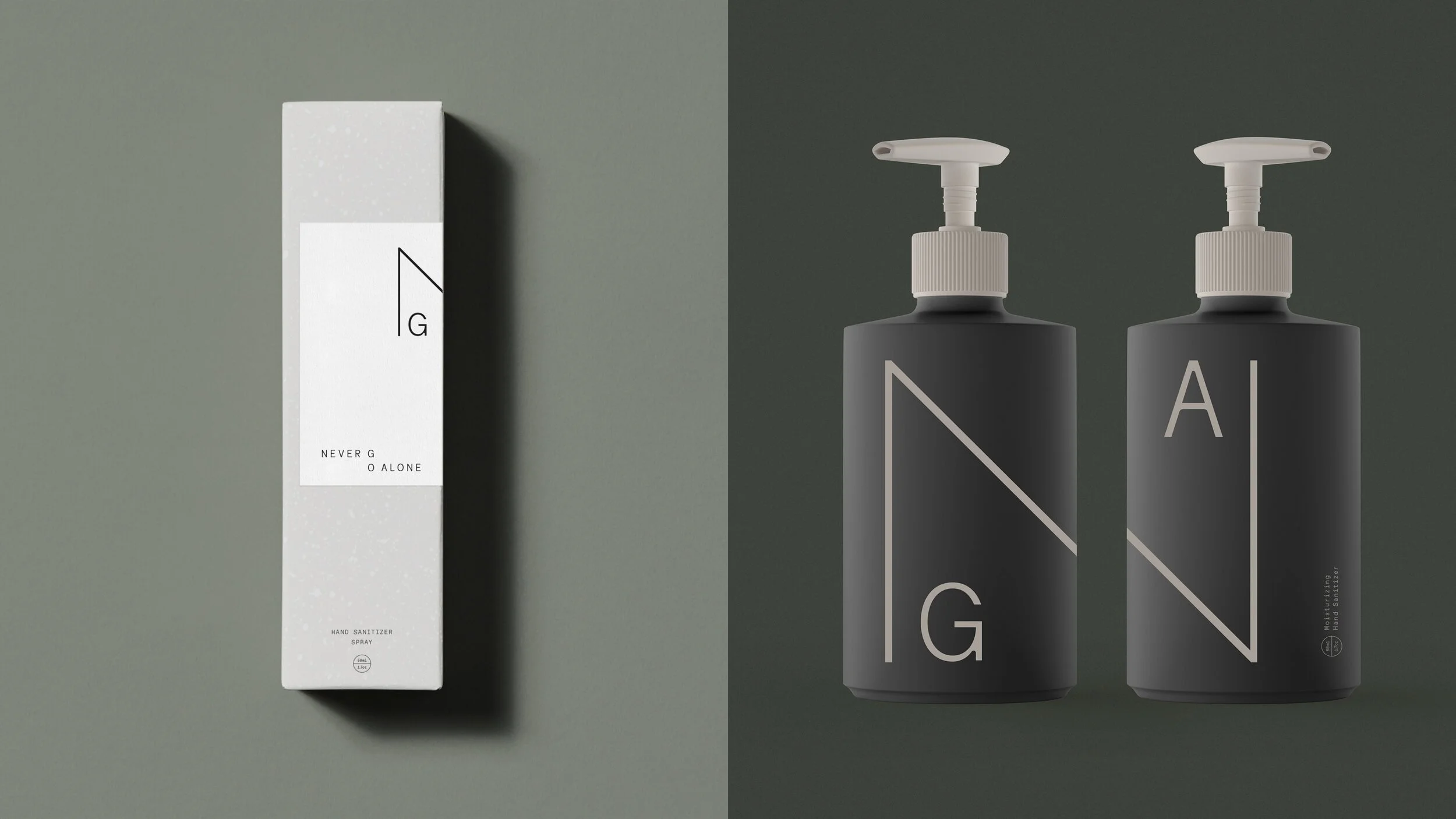
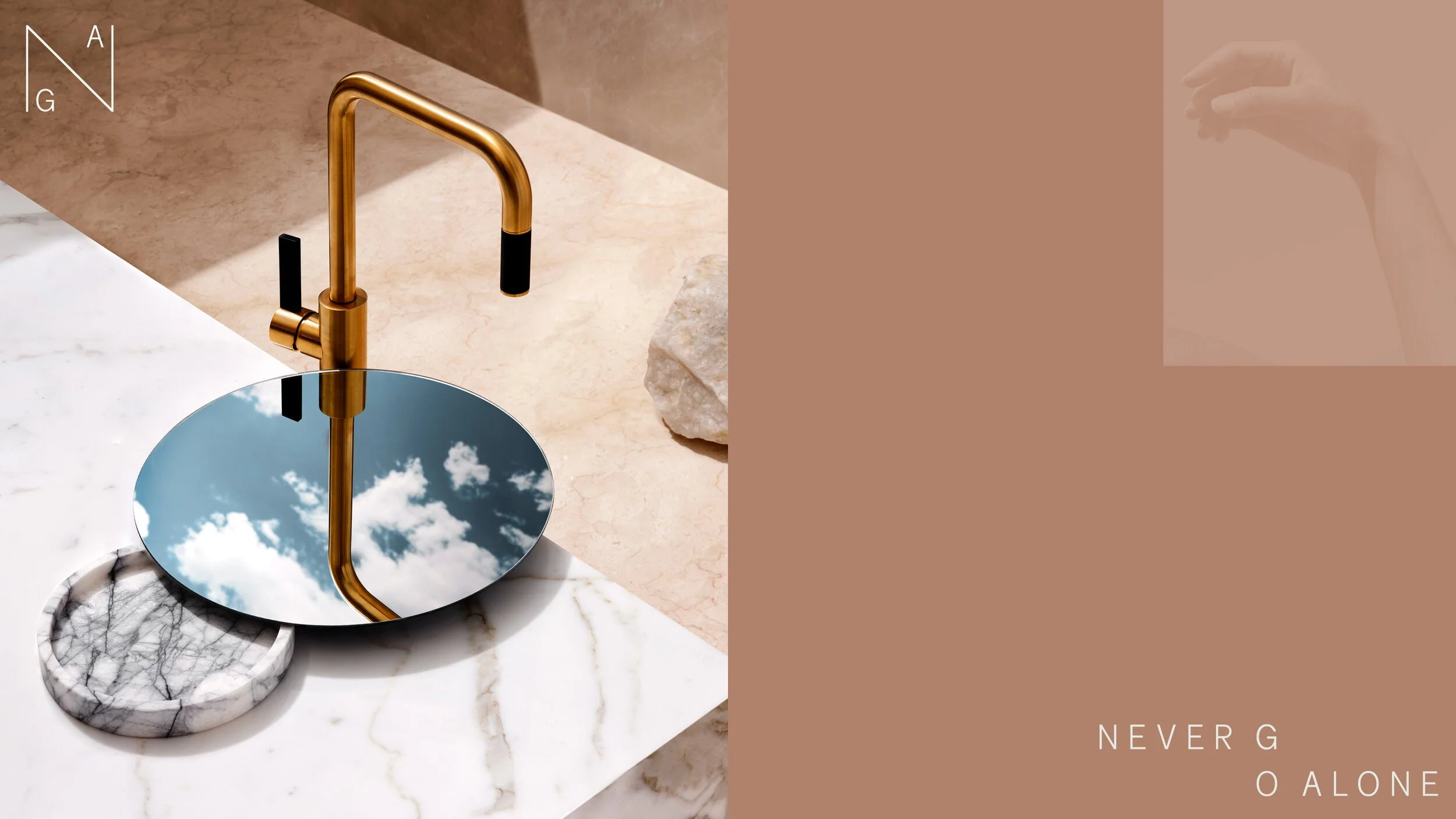
From the biggest idea to the smallest gesture,
we strive to make it supergood.
ART DIRECTION & DESIGN THINKING
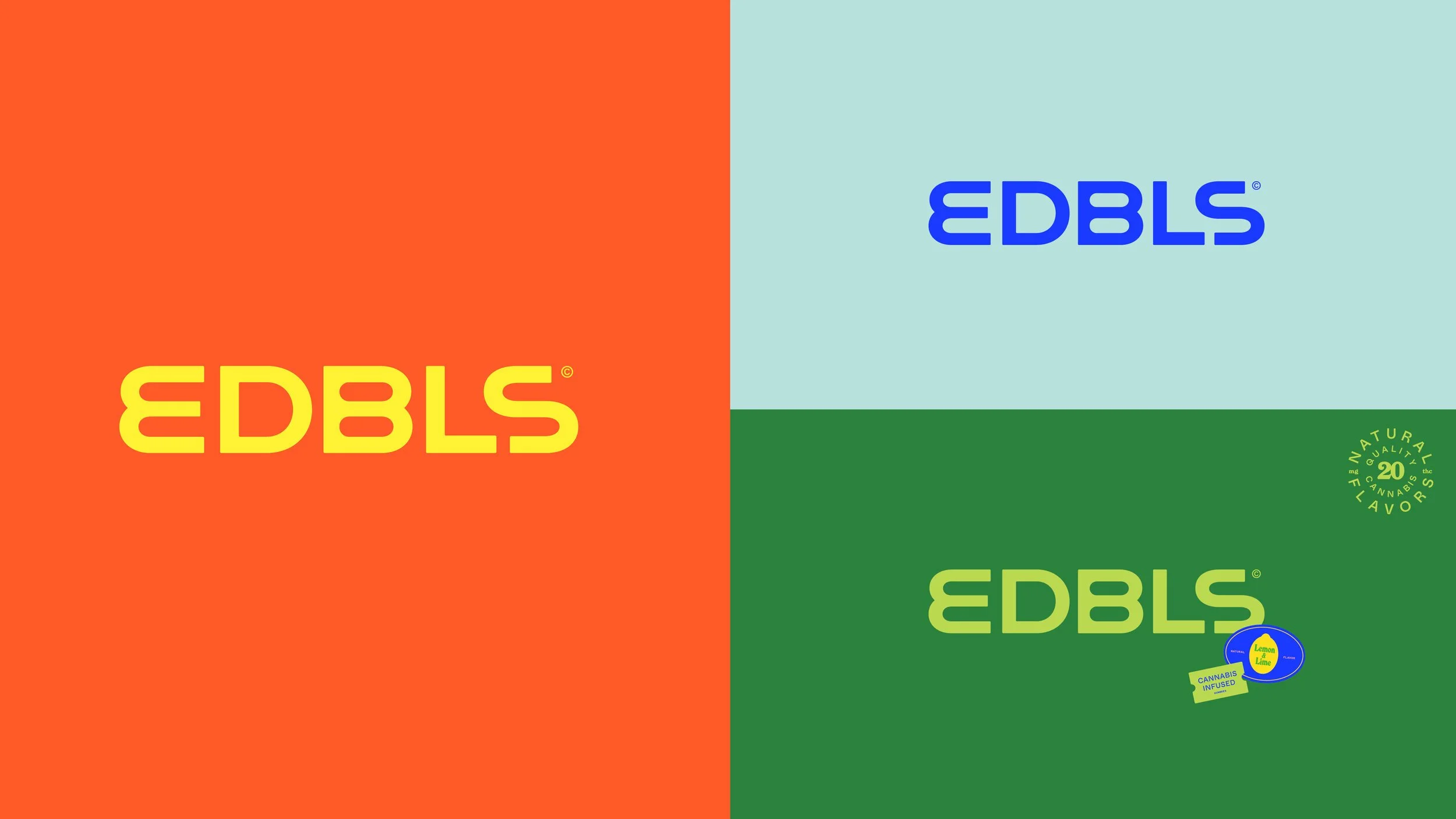
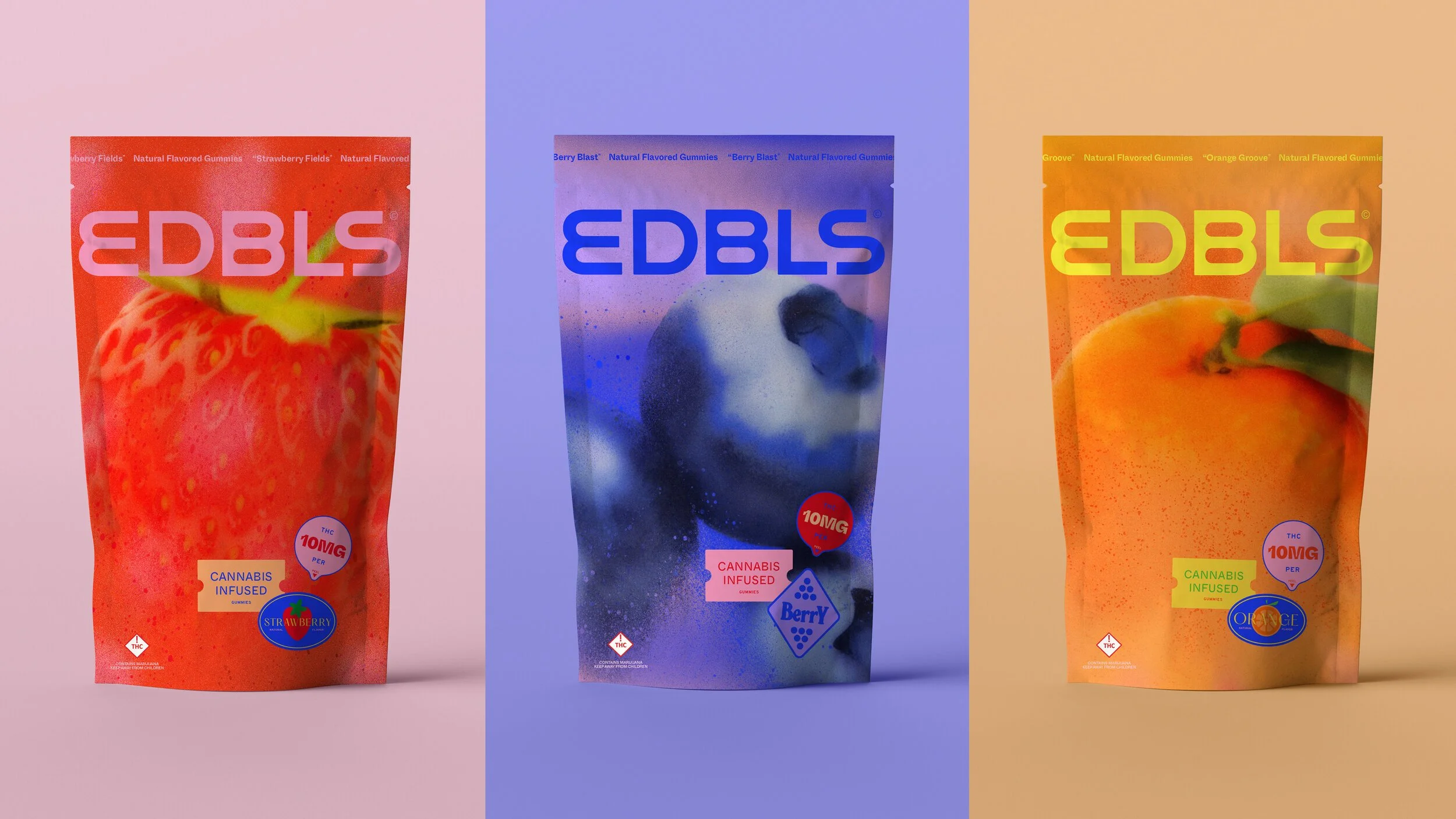
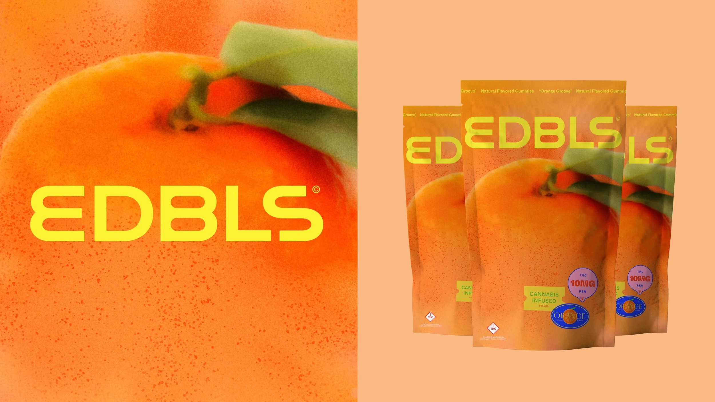
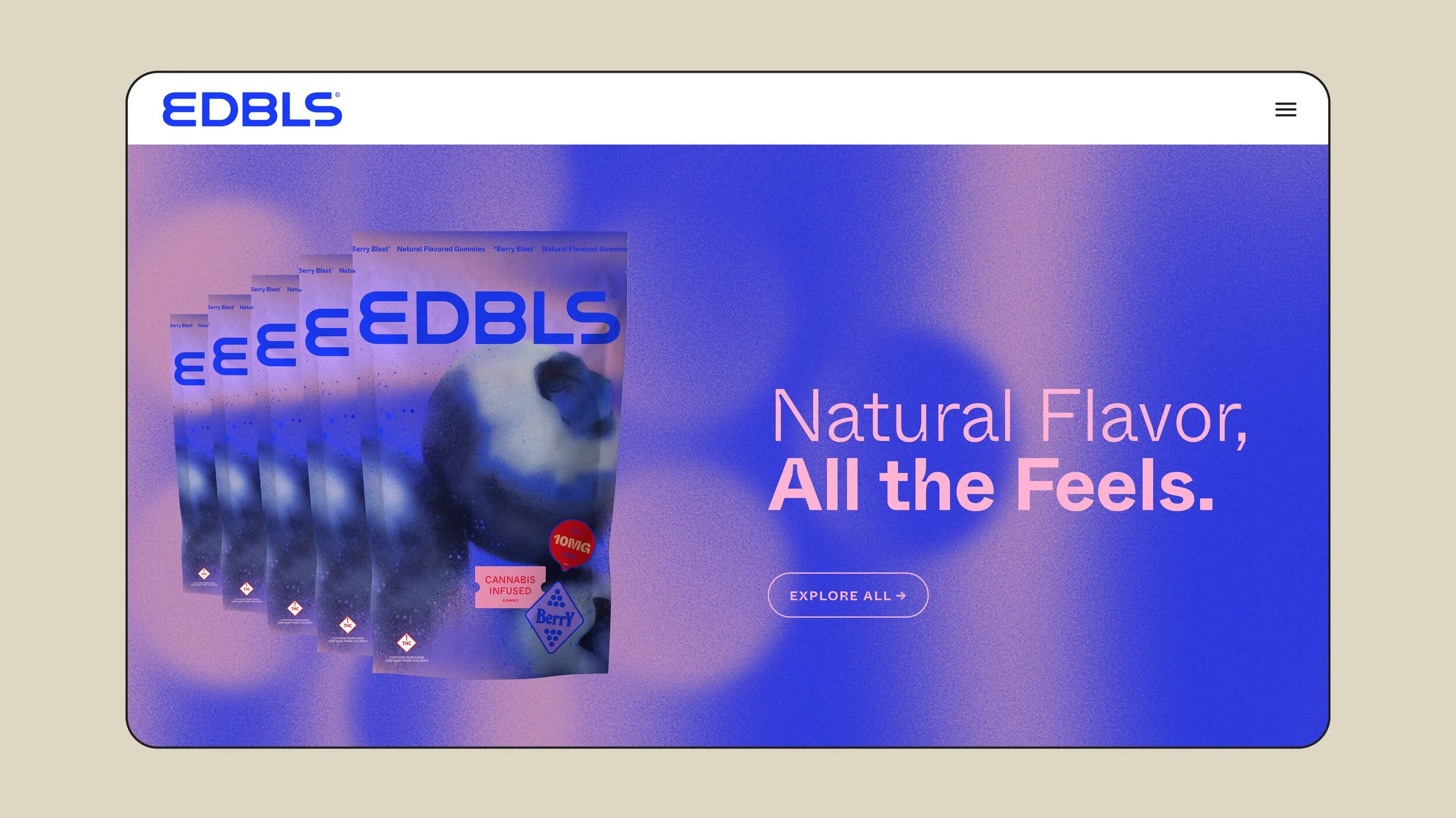
Full Brand Identity and collateral for Kansas City based EDBLS. Brand officially launching late 2021, full case study to follow.
LOOKS LIKE IT FEELS
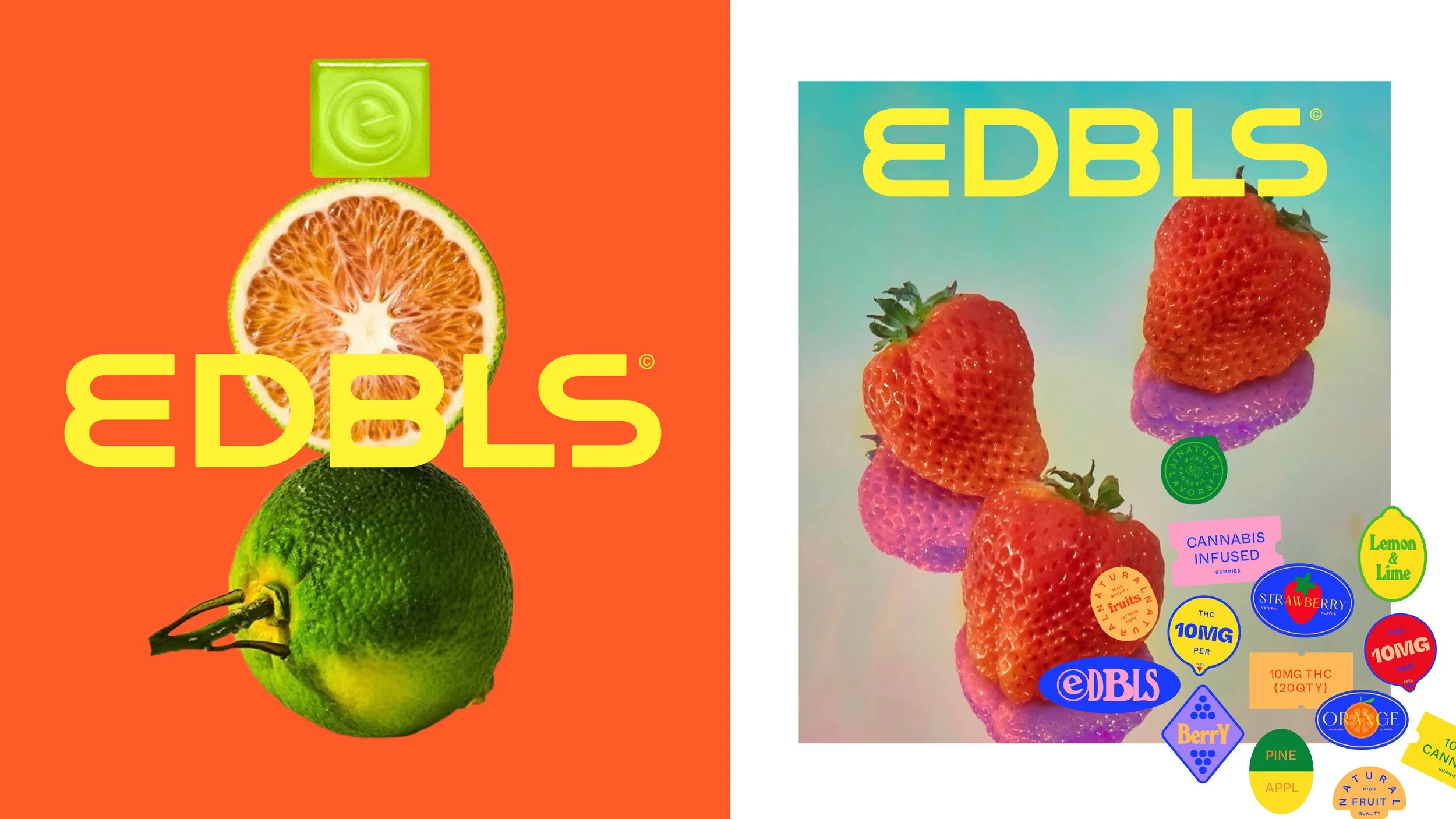
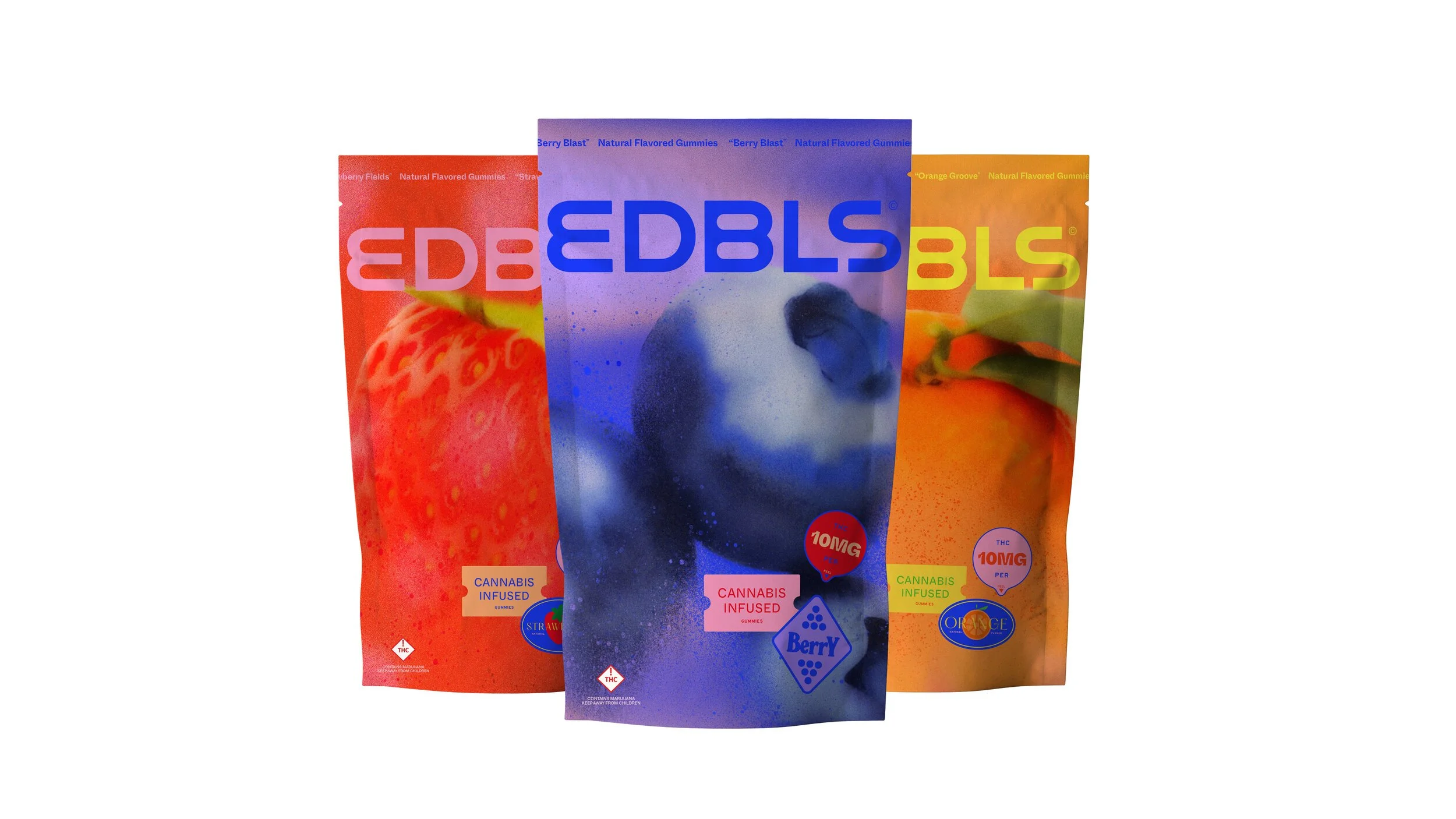
Cannabis is all about feeling good, and yet most edibles on the market today look identical and mimic the yogurt section of a grocery store. ‘Looks Like It Feels’ became the creative mantra and guiding principle, bringing to life a more vibrant, euphoric design system that helped differentiate the brand in the space.
GRAPHIC LANGUAGE
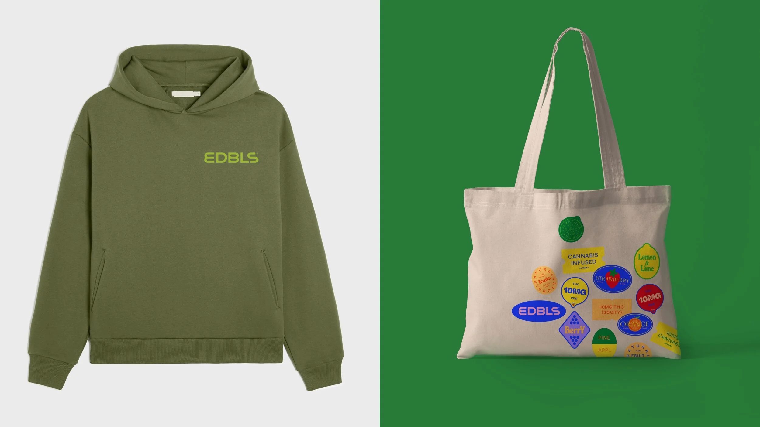
The founders wanted a bold and vibrant brand that was still very accessible. Flavor is a big differentiator for the line, so leading with unique illustrations and ubiquitous fruit stickers helped establish a fun twist to the graphic language.
ART DIRECTION & DESIGN THINKING
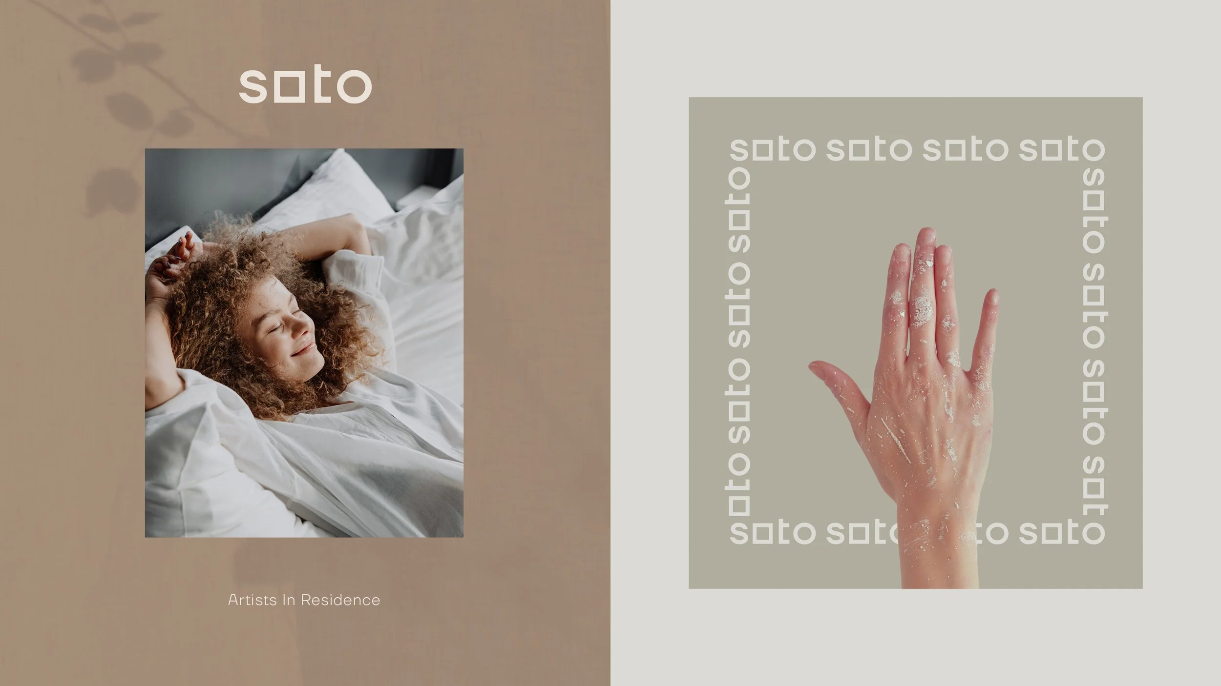
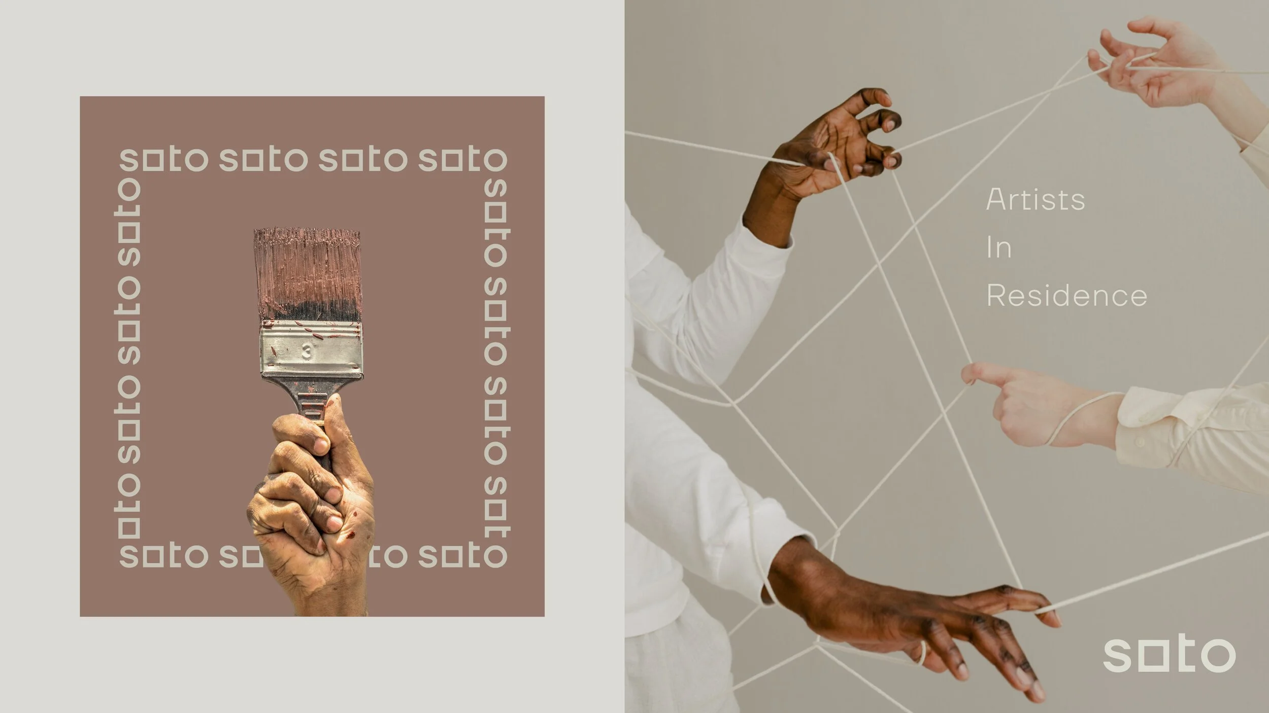
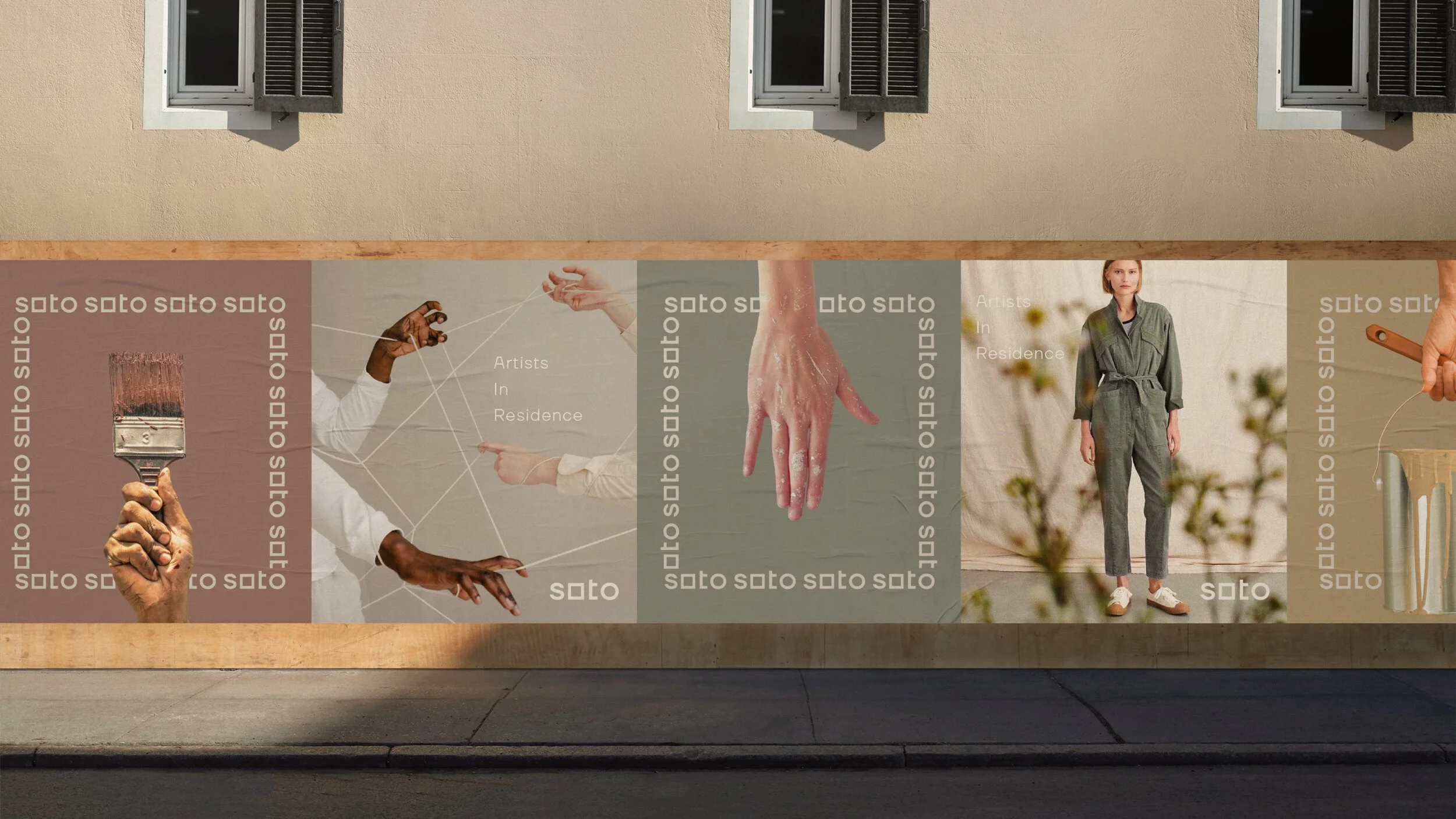
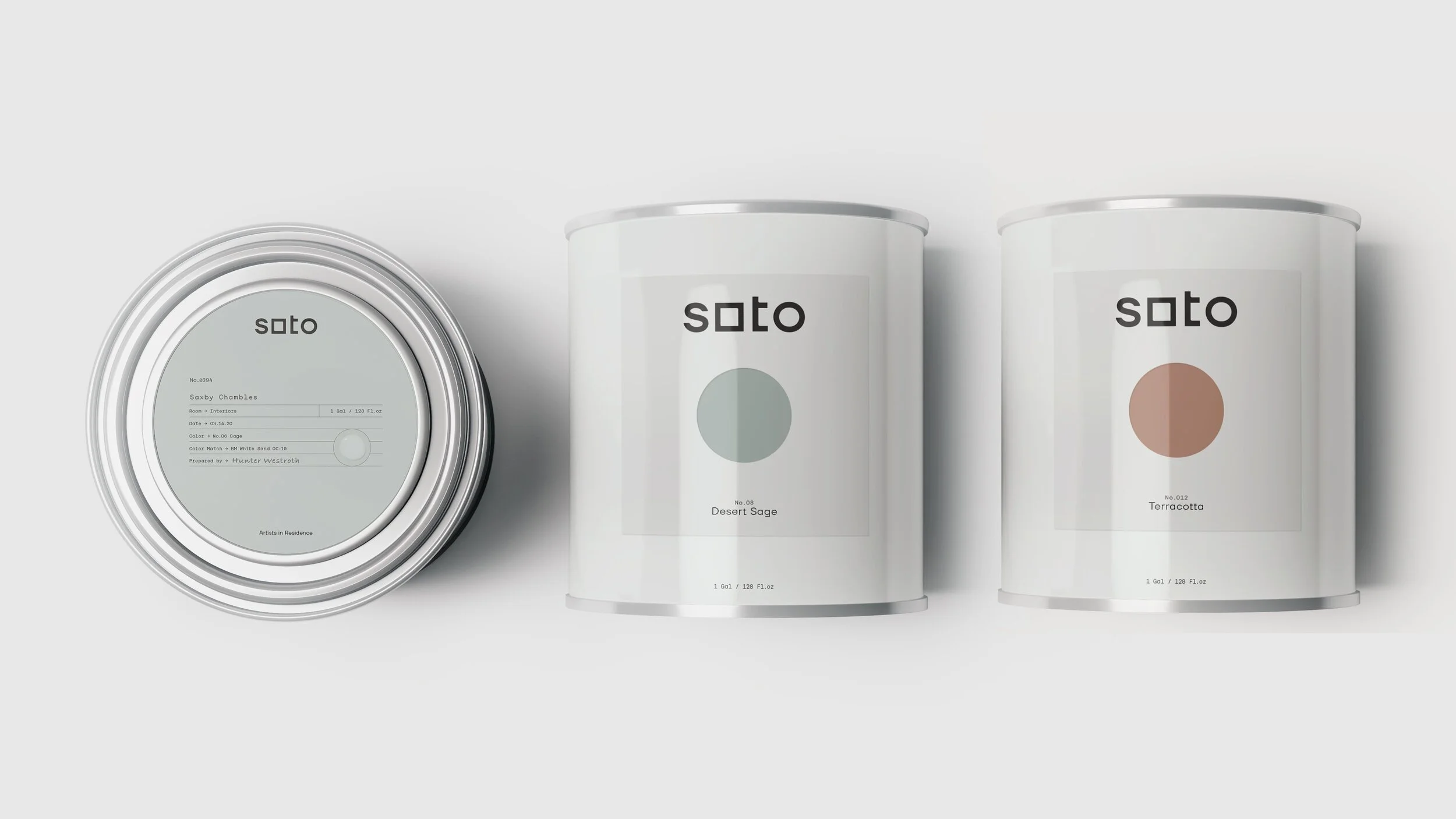
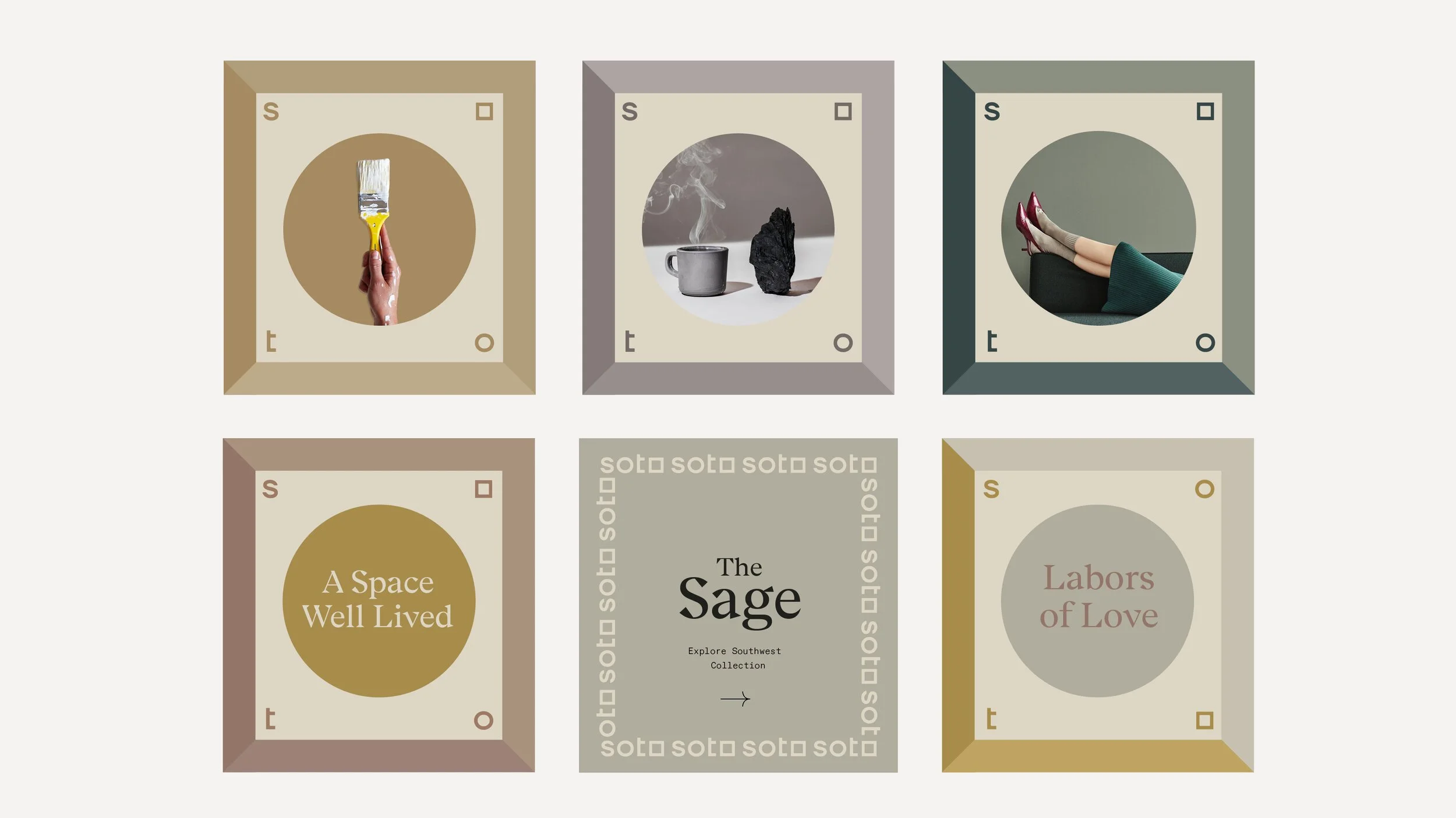
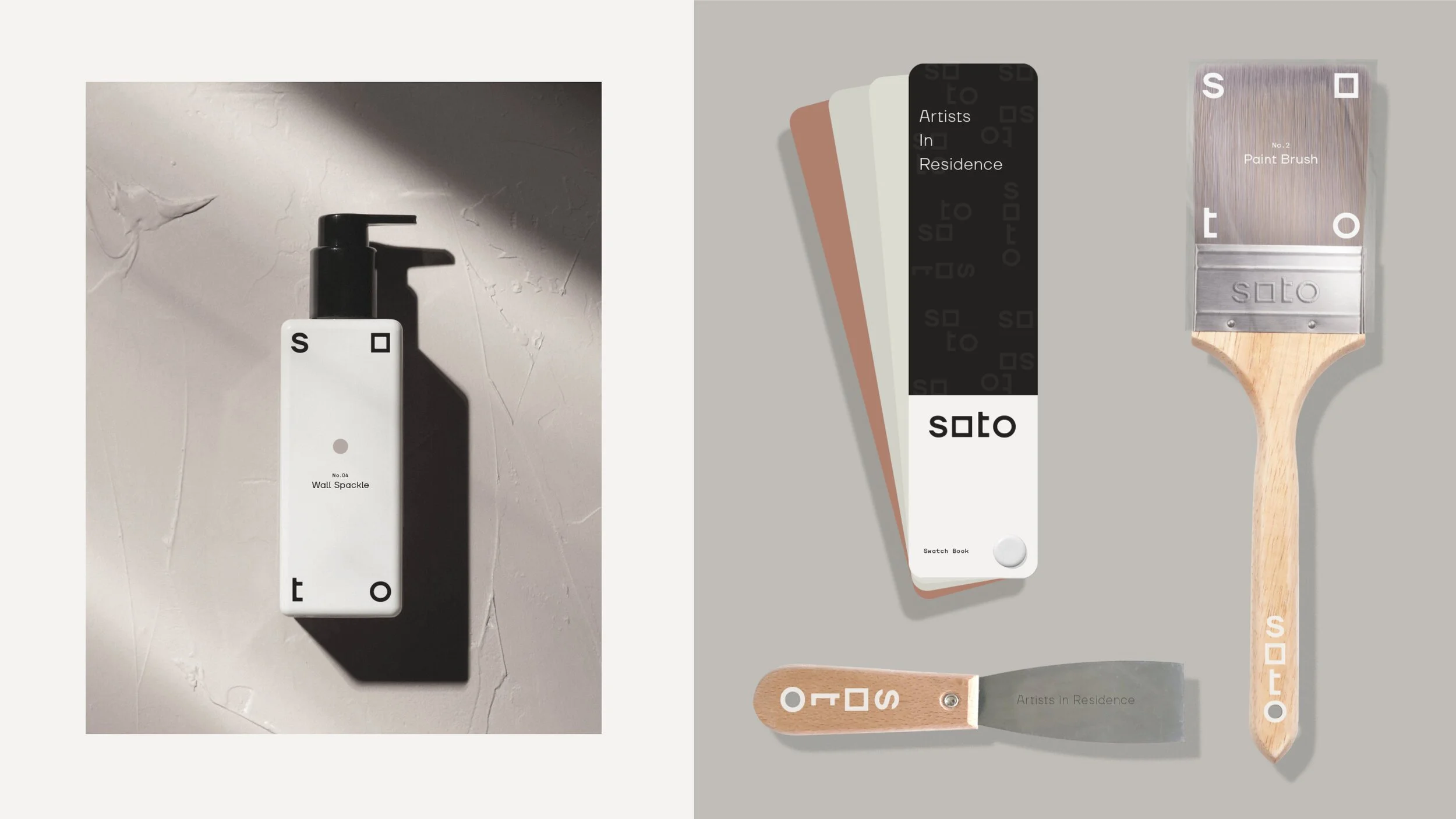
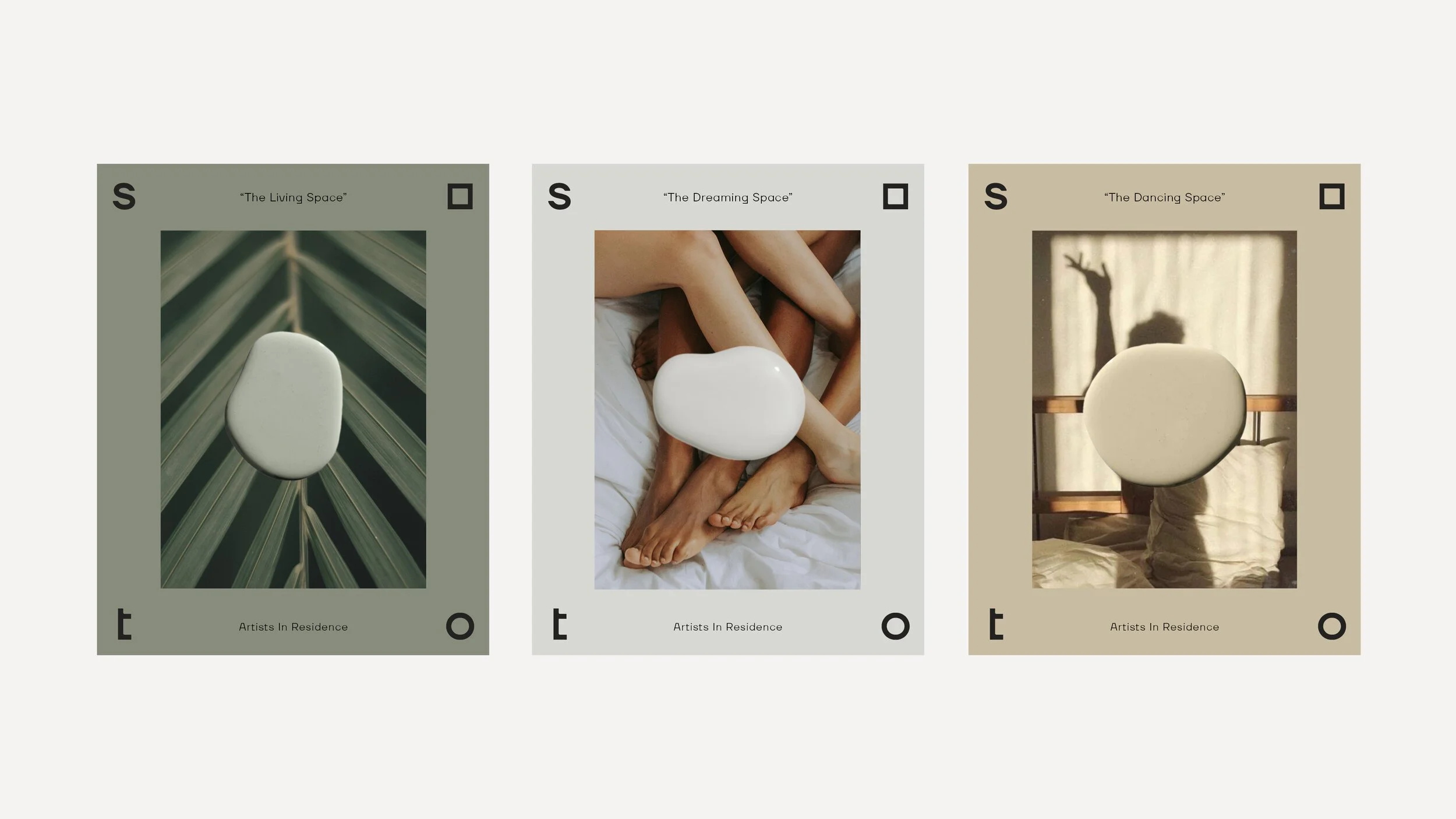
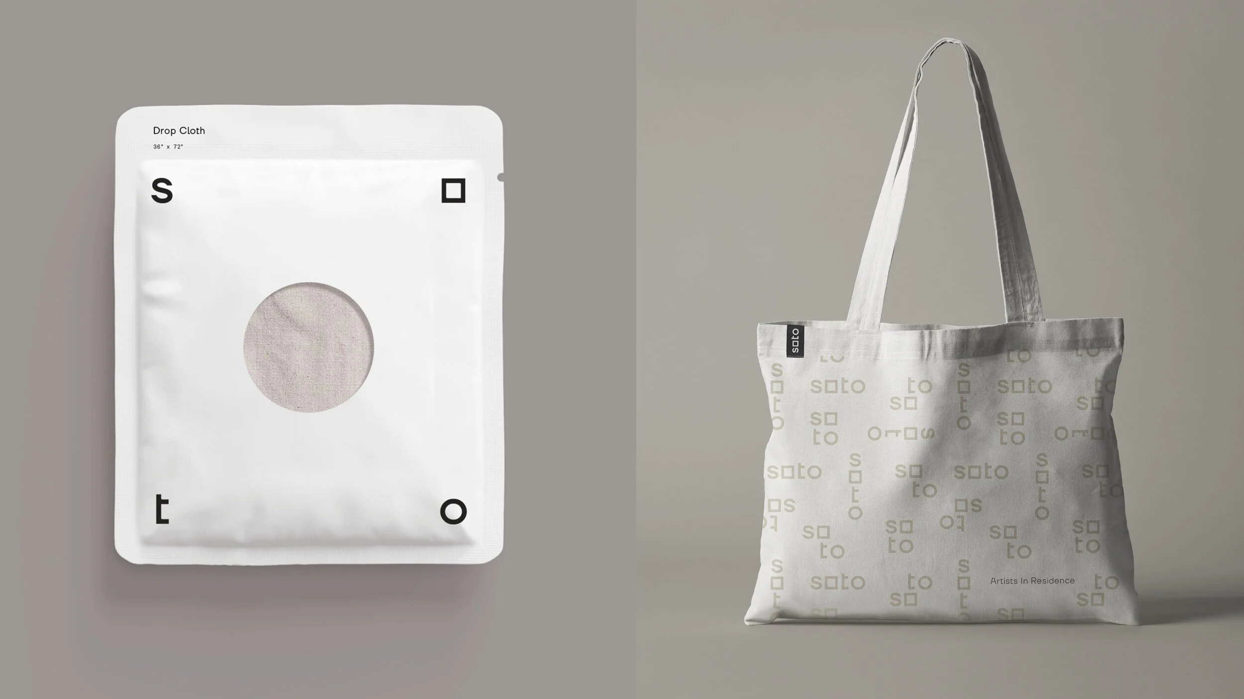
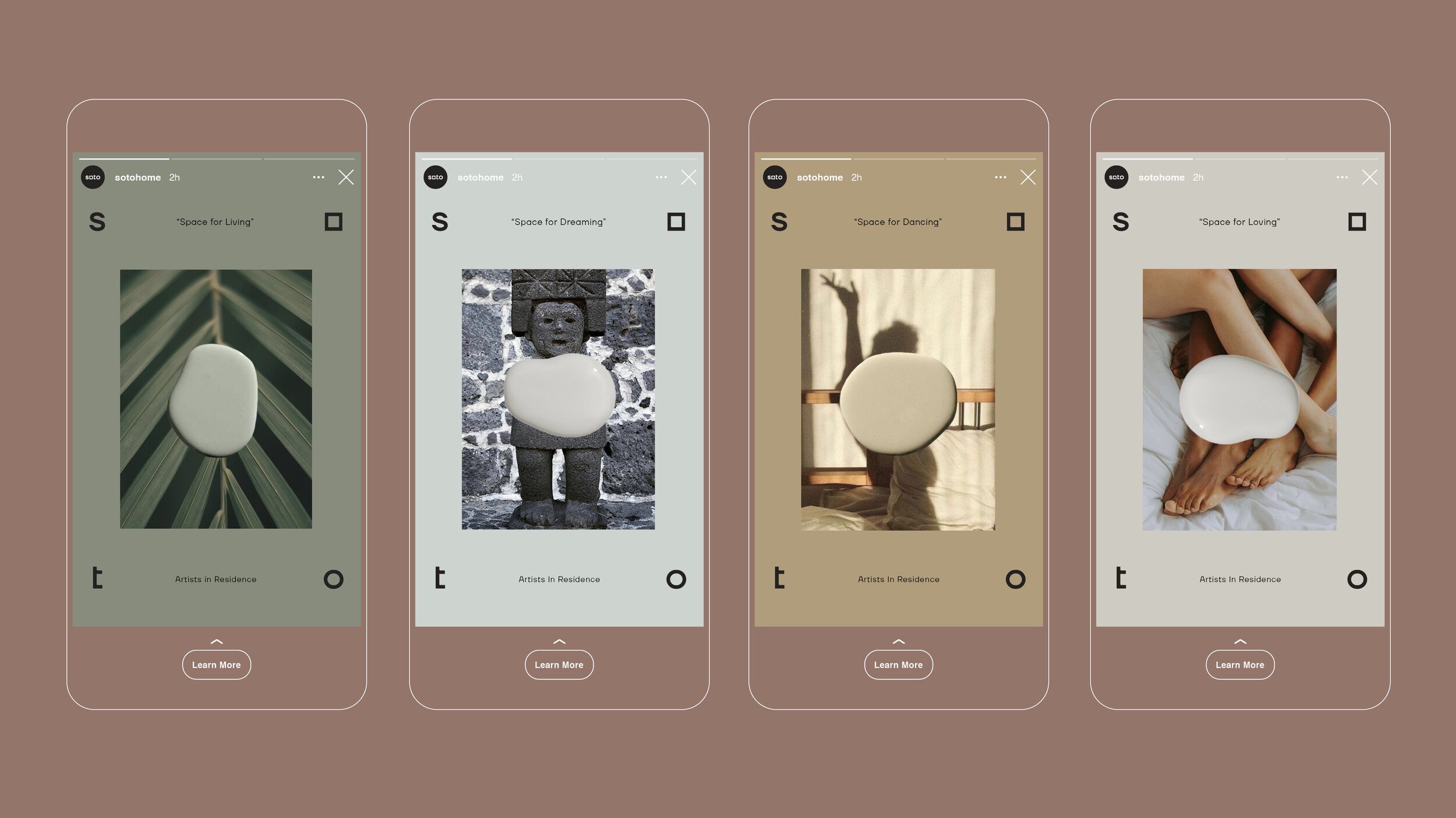
Identity re-brand and collateral for Soto, a thoughtful and curated home improvement company launching late 2021.
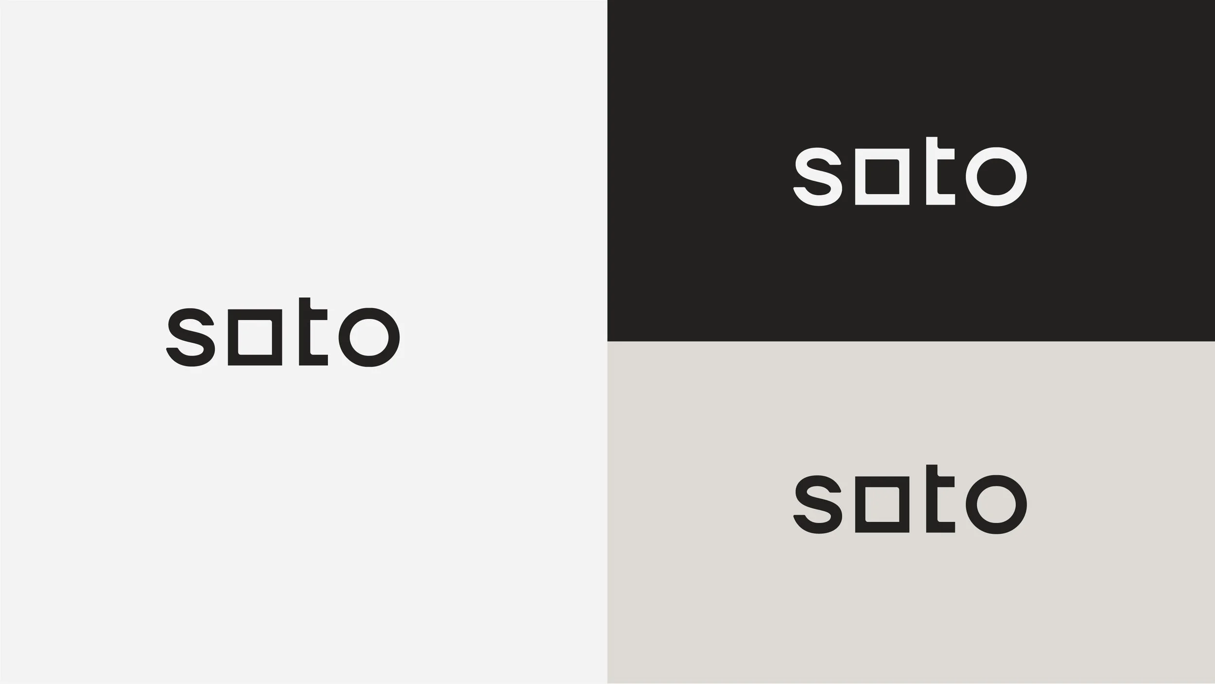
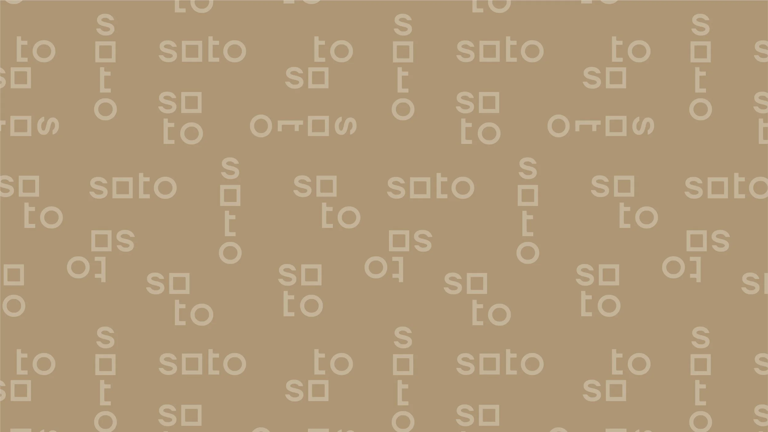
CHANGING SPACES
The notion of change comes to life in various ways across the identity, from the simple square to circle shift in the logo’s “o” letterforms, to the dynamic, flexible patterns, logo orientations and layouts that the graphic toolkit adapts to.
ART DIRECTION & DESIGN THINKING
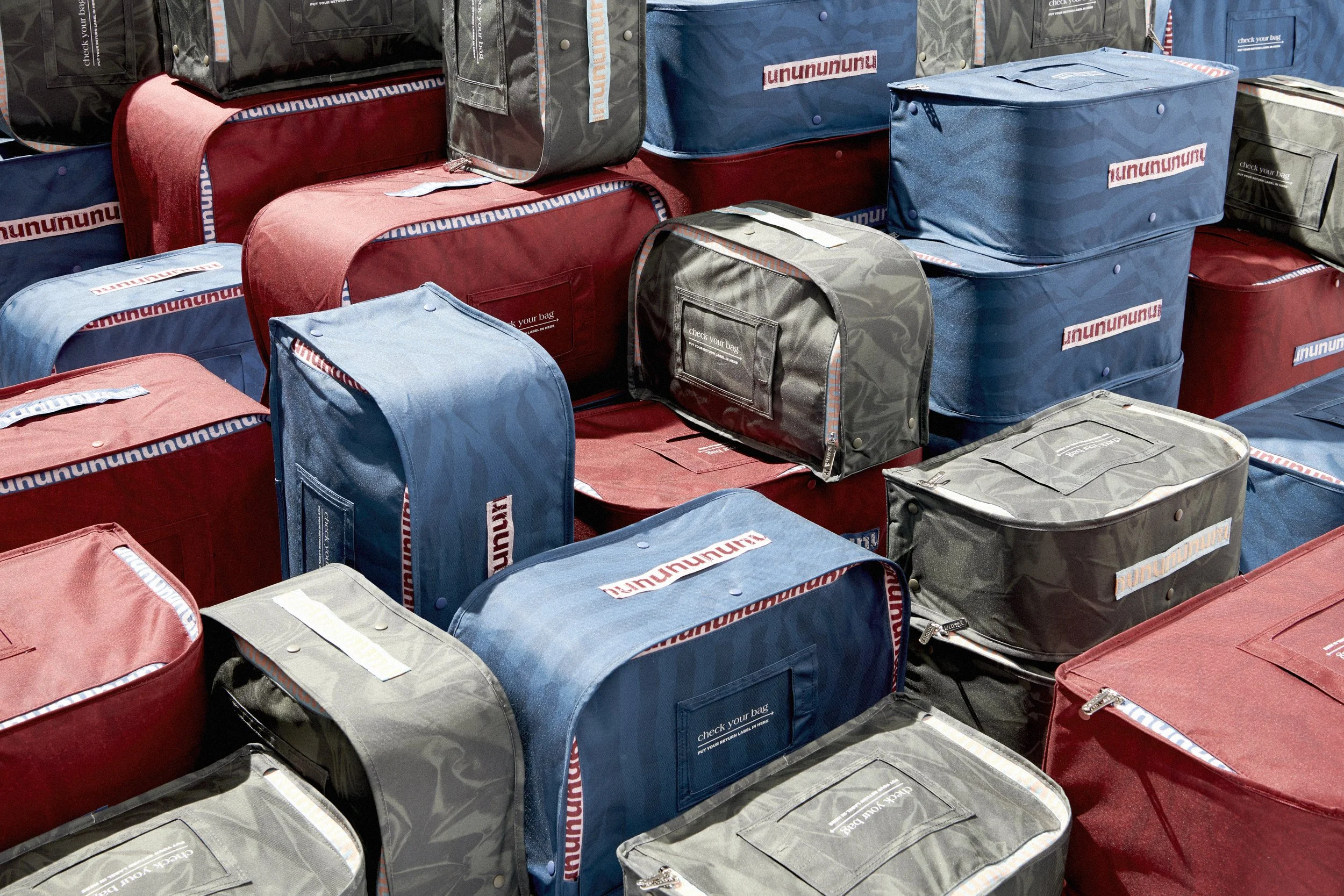
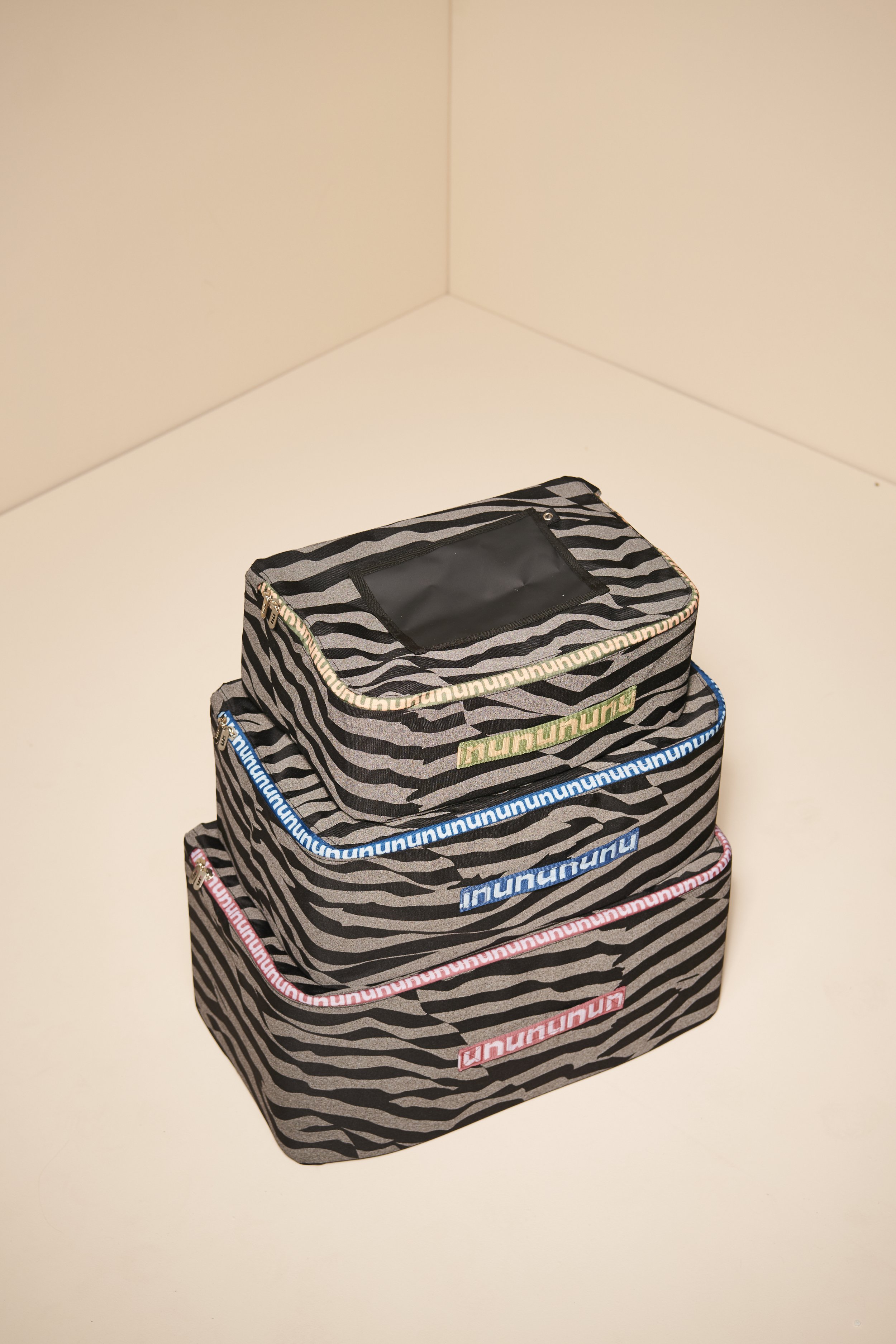
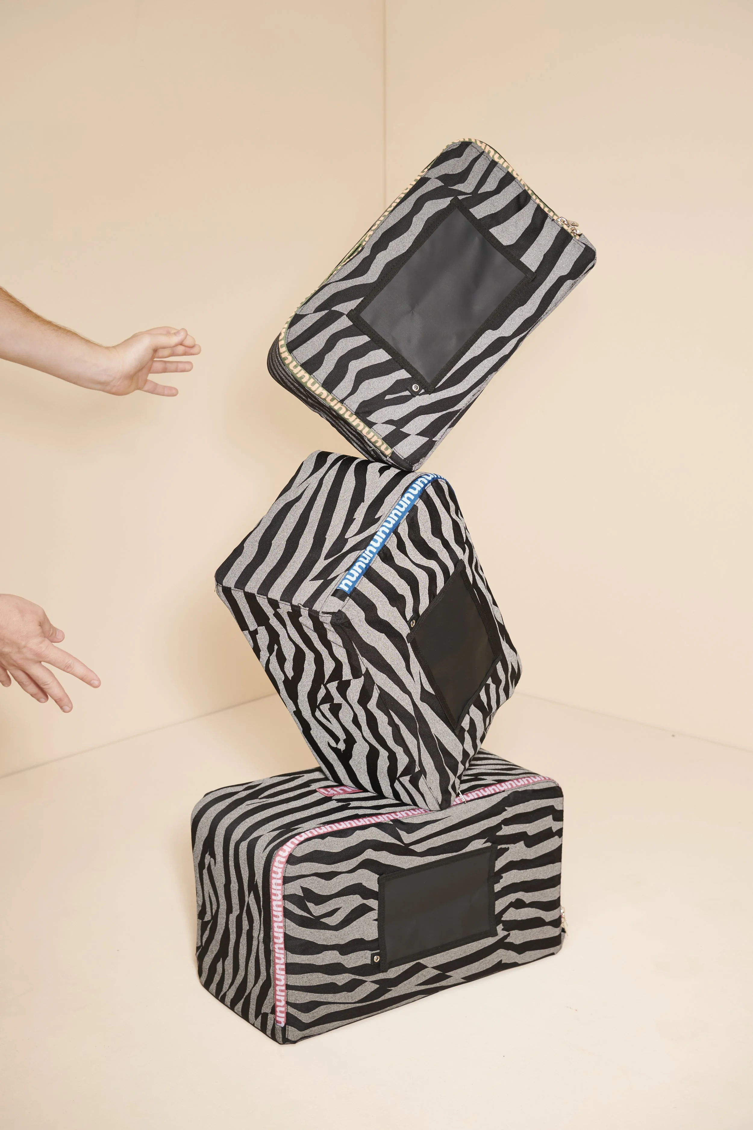
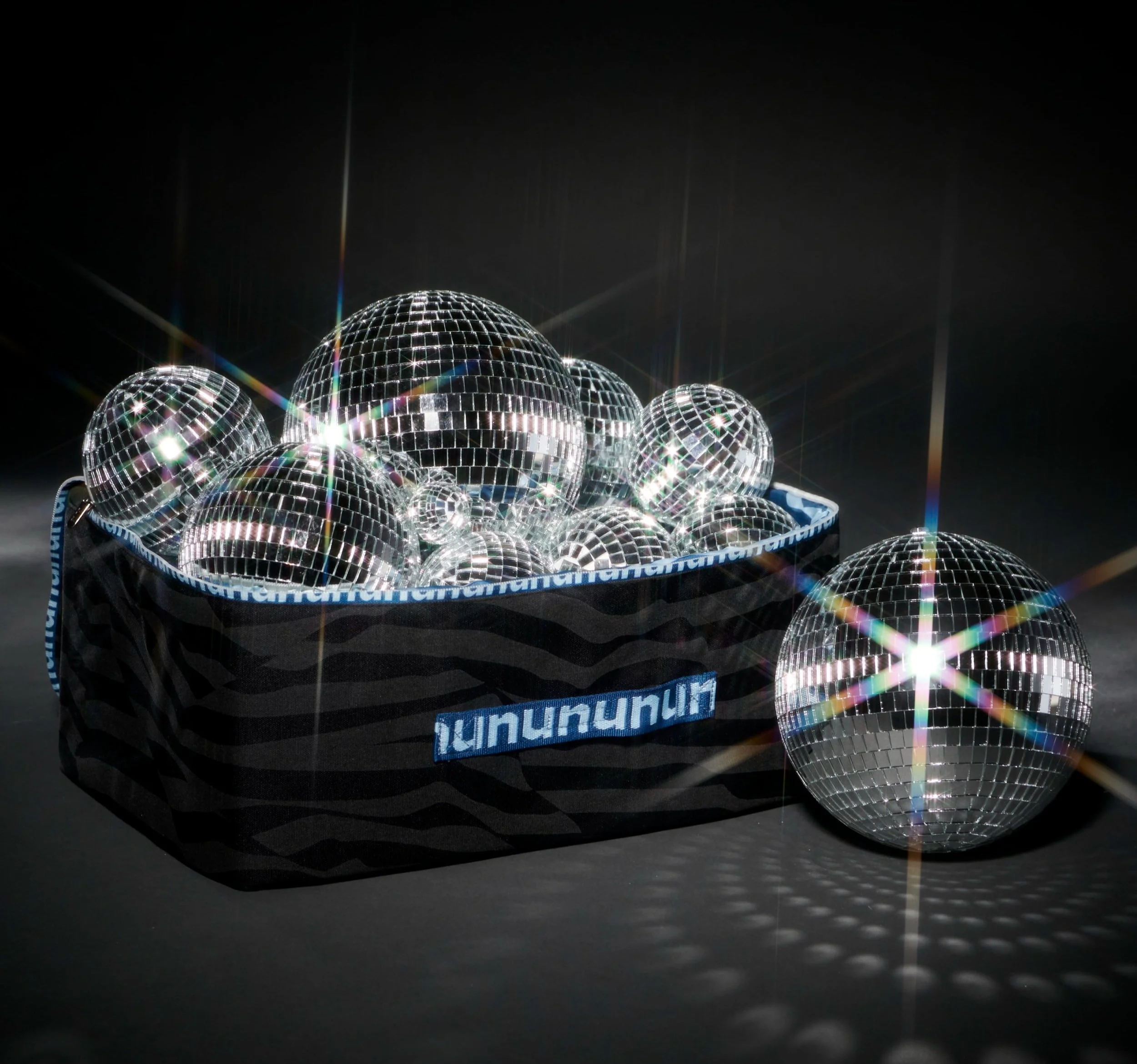
Shipping totes made of 100% recycled materials designed to replace single use cardboard boxes. With a lifecycle thats 10x what’s a cardboard box would be, these totes revolutionized how nuuly ships and interacts with it’s community.
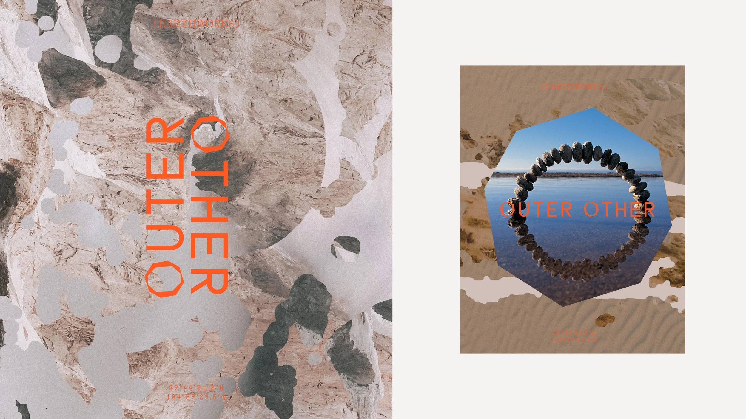
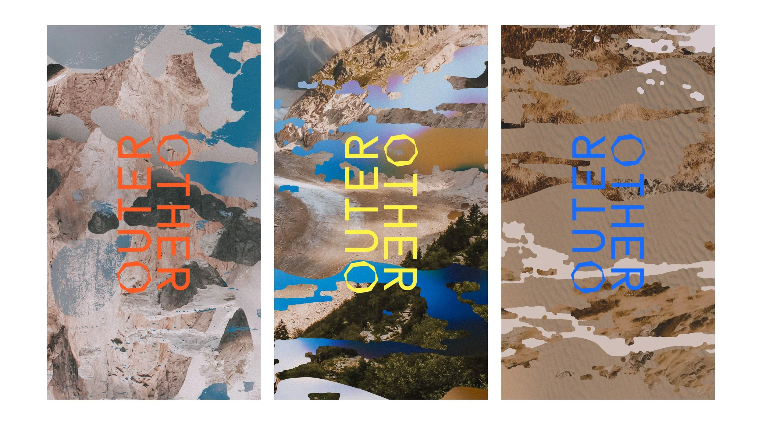
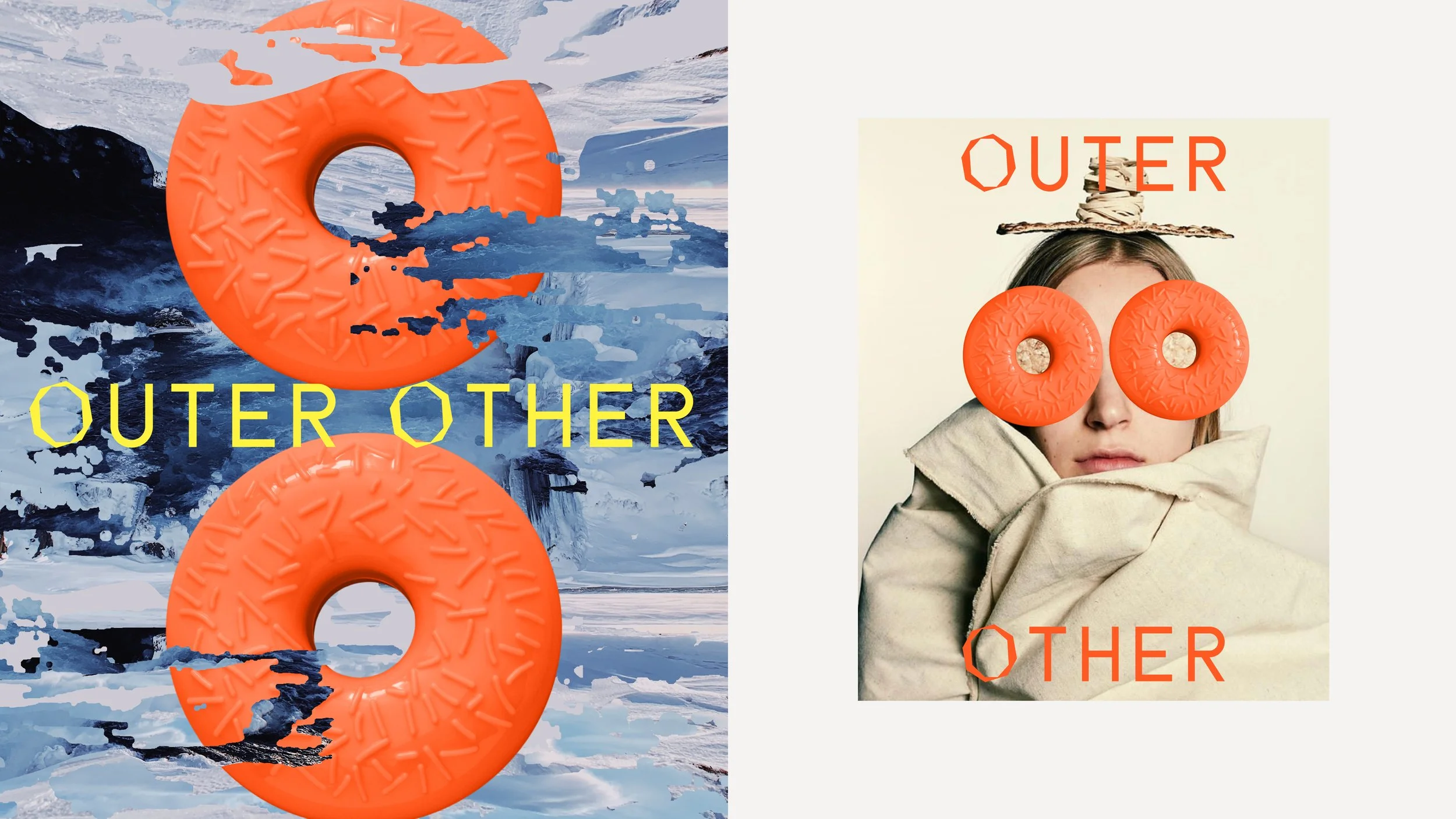
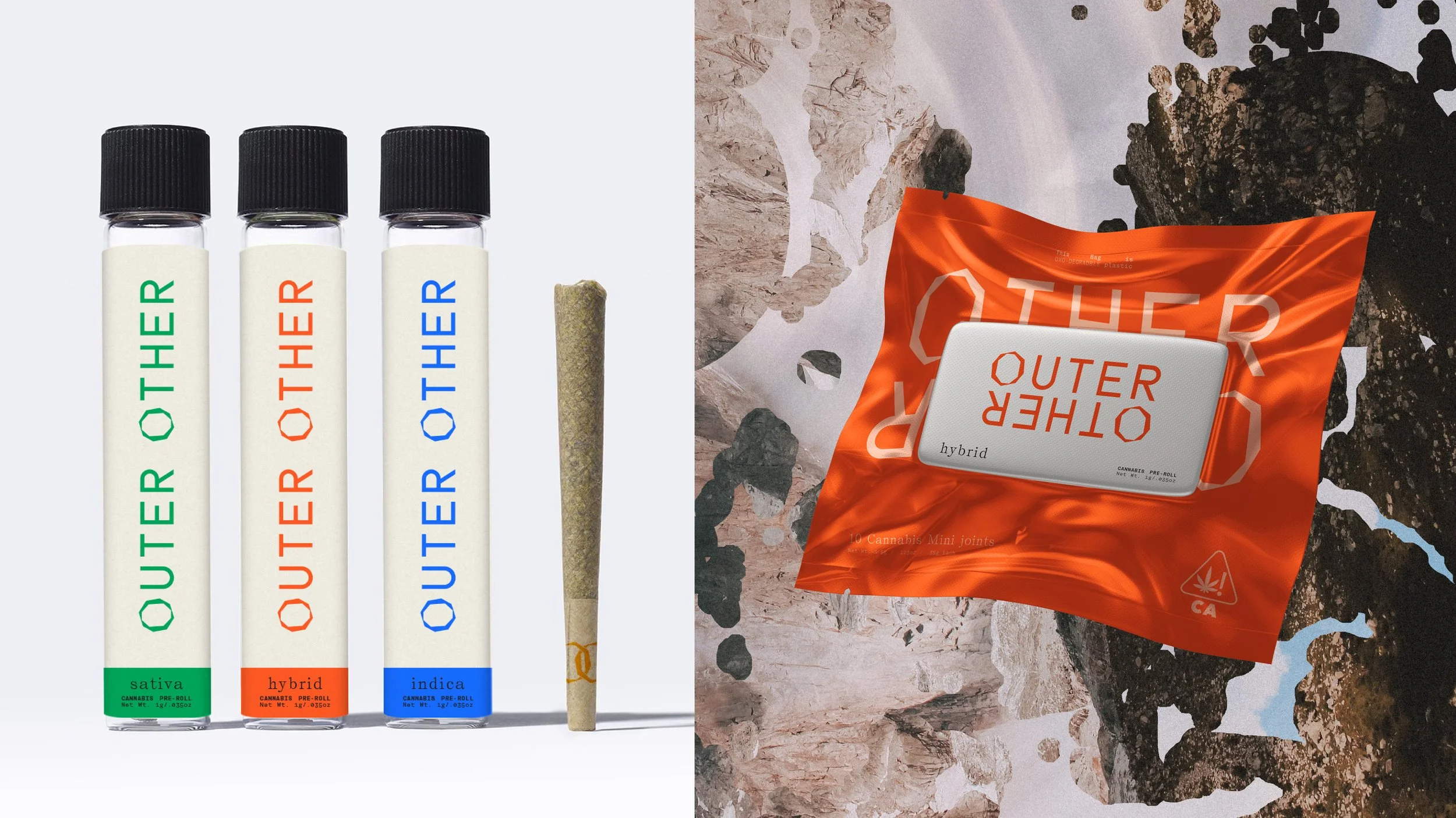
ART DIRECTION & DESIGN THINKING
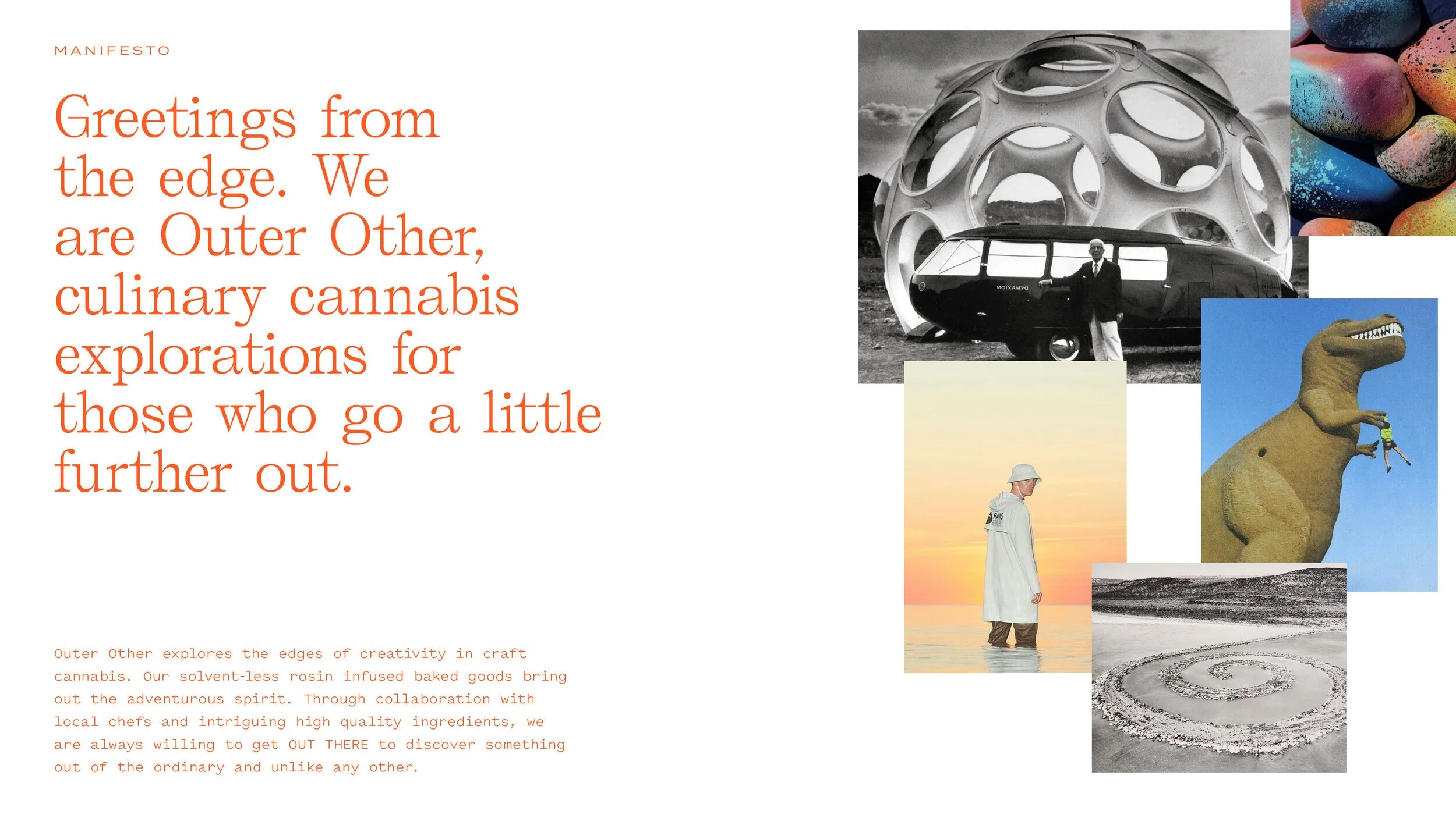
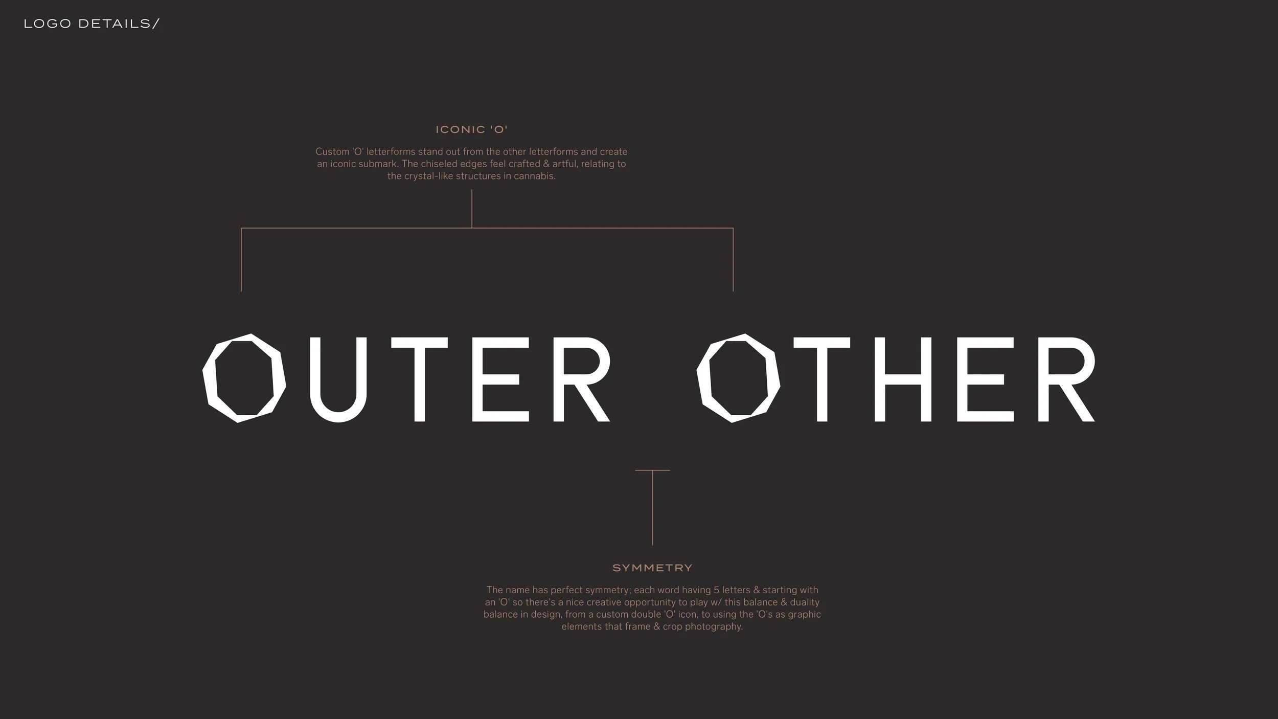
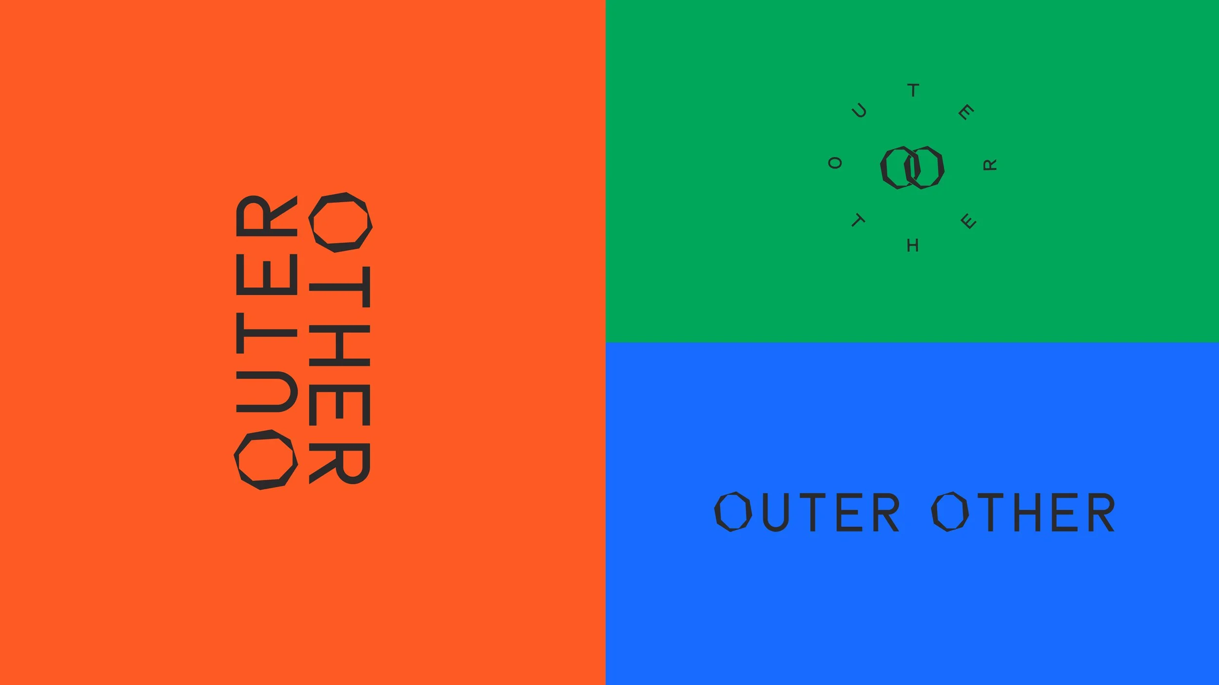
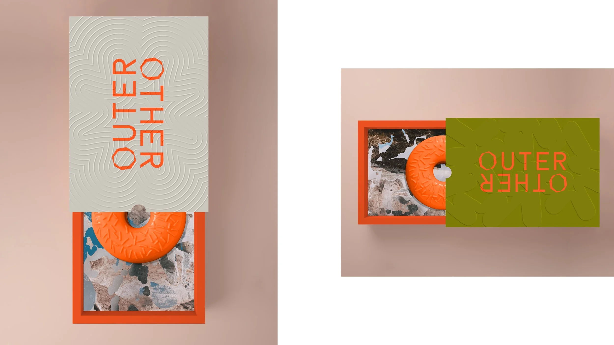
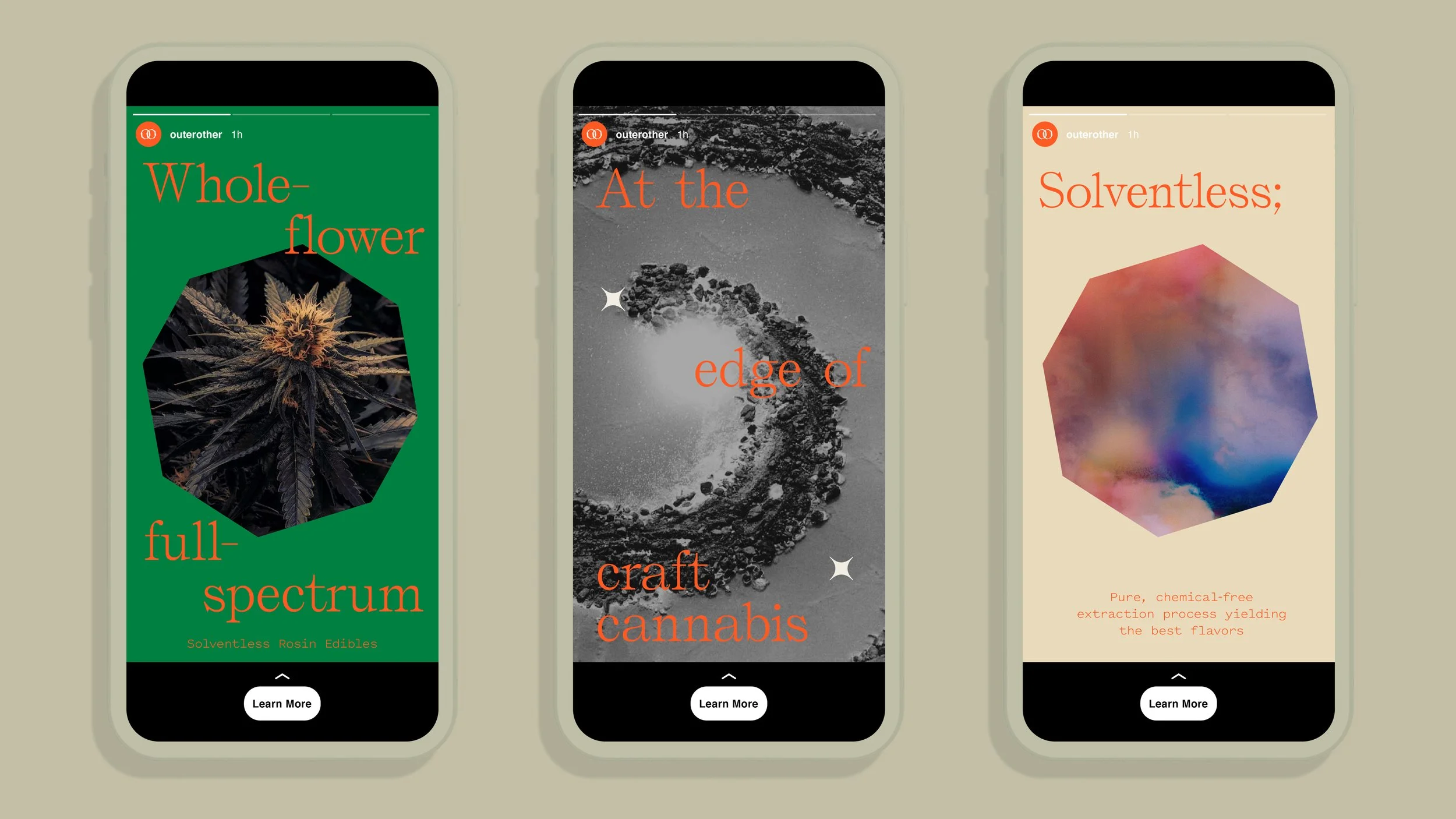
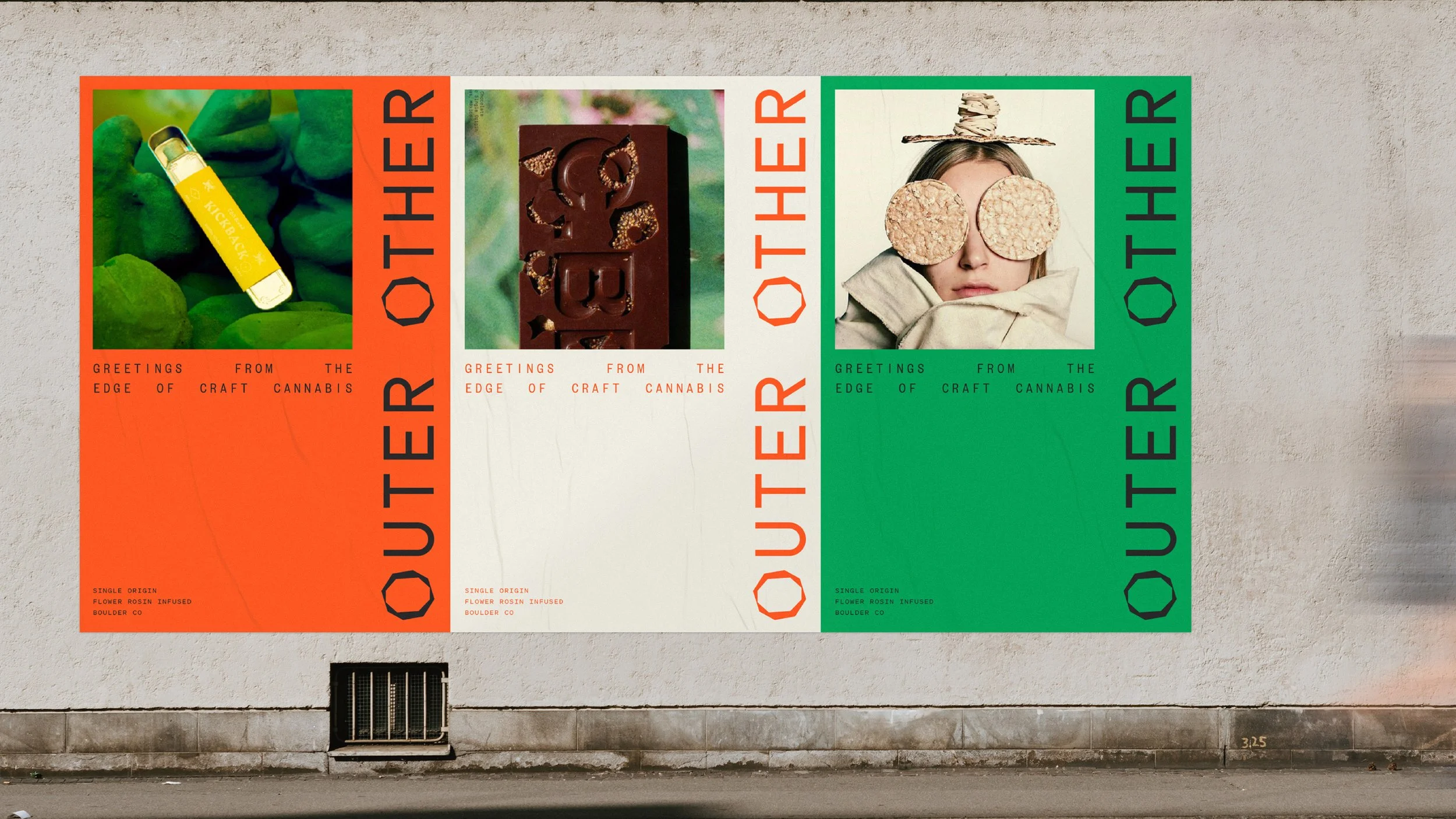
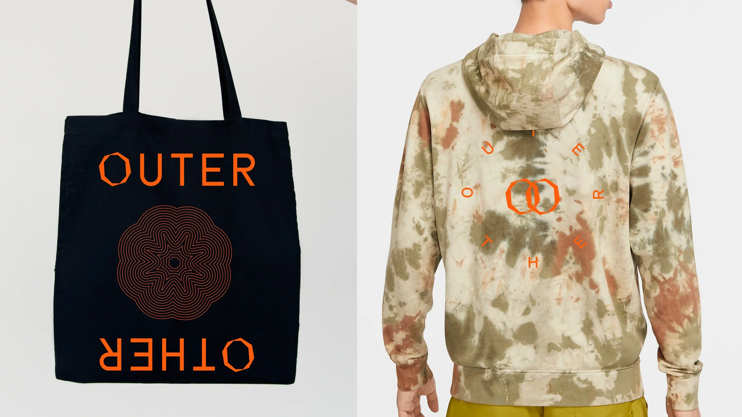
Concept, Naming, Brand Identity, Voice, Packaging & Collateral Design for Outer Other, a new cannabis brand built on creativity in craft cannabis launching late 2021.
ART DIRECTION & DESIGN THINKING
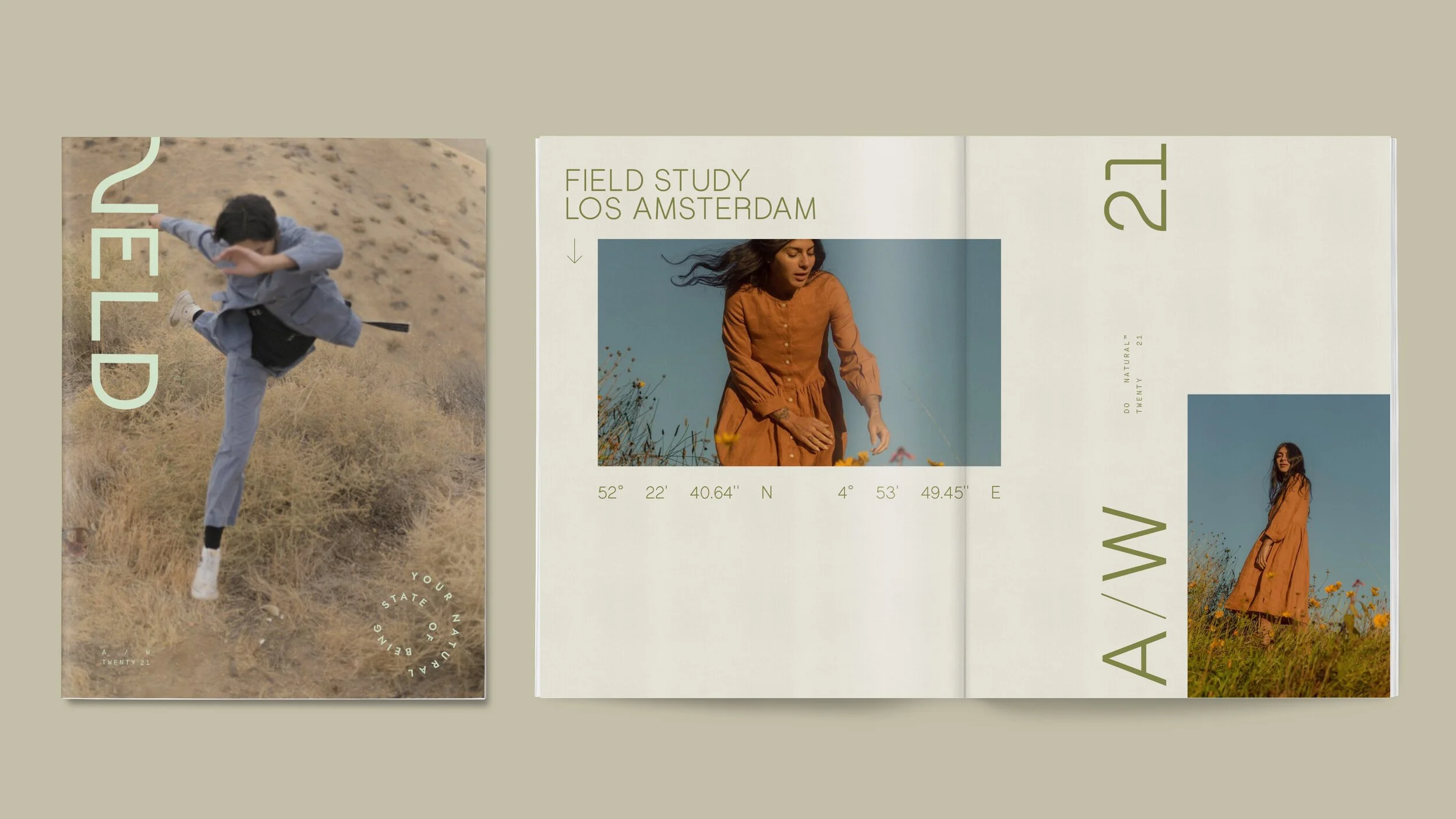
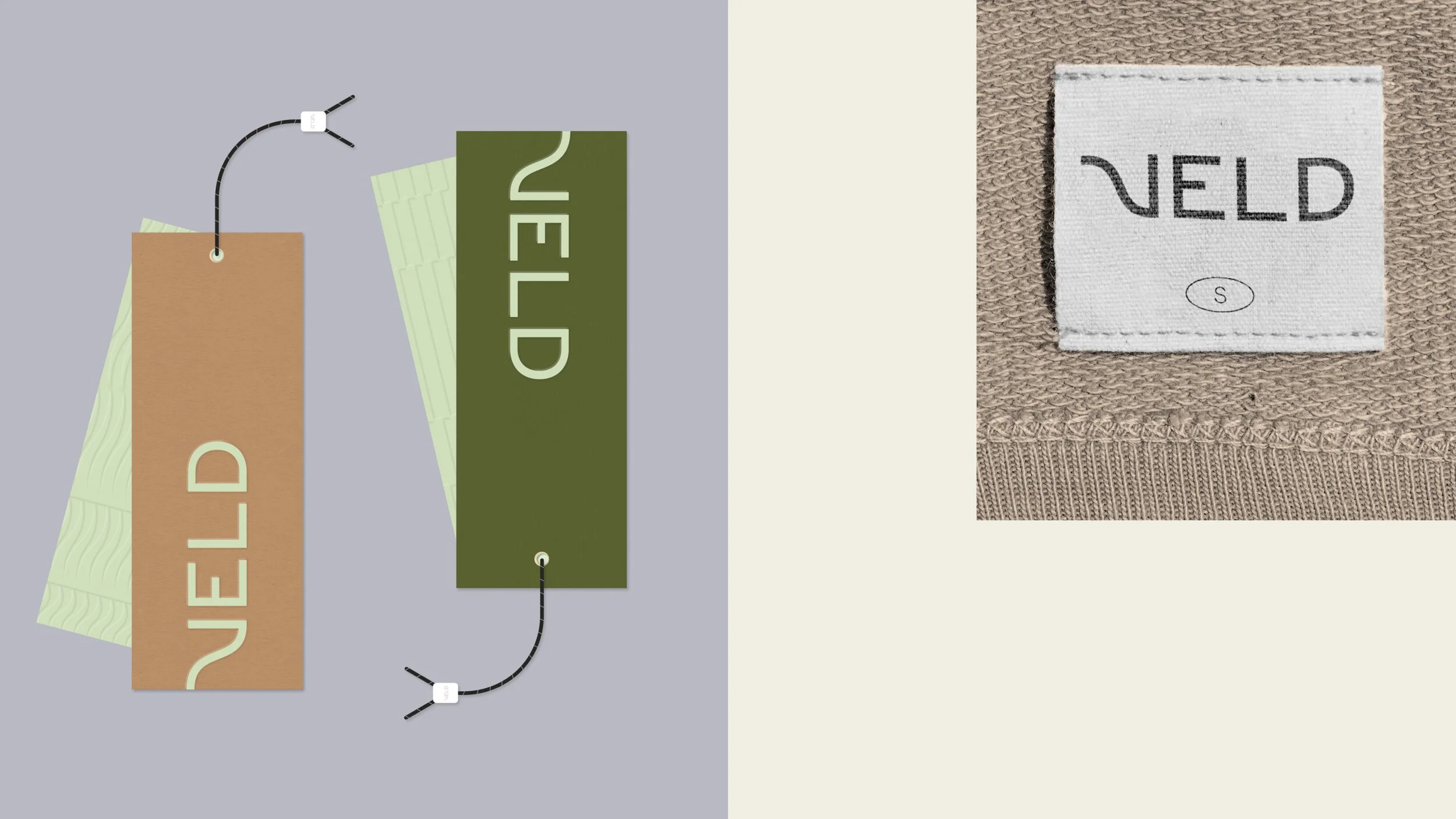
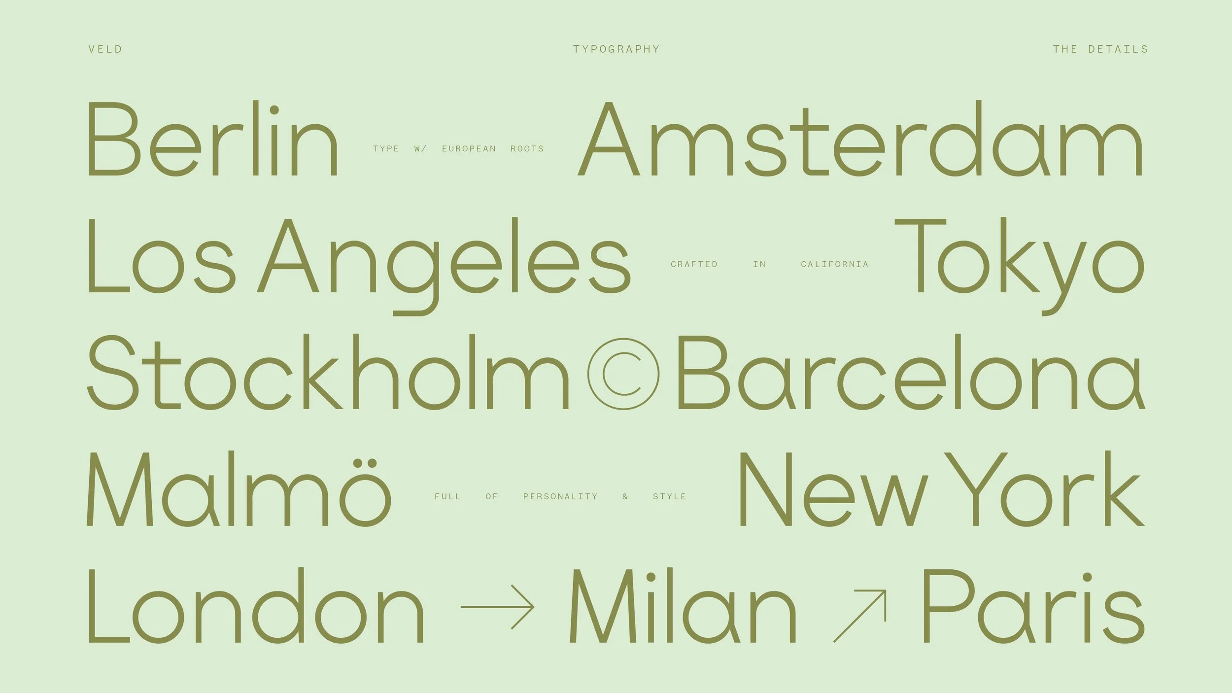
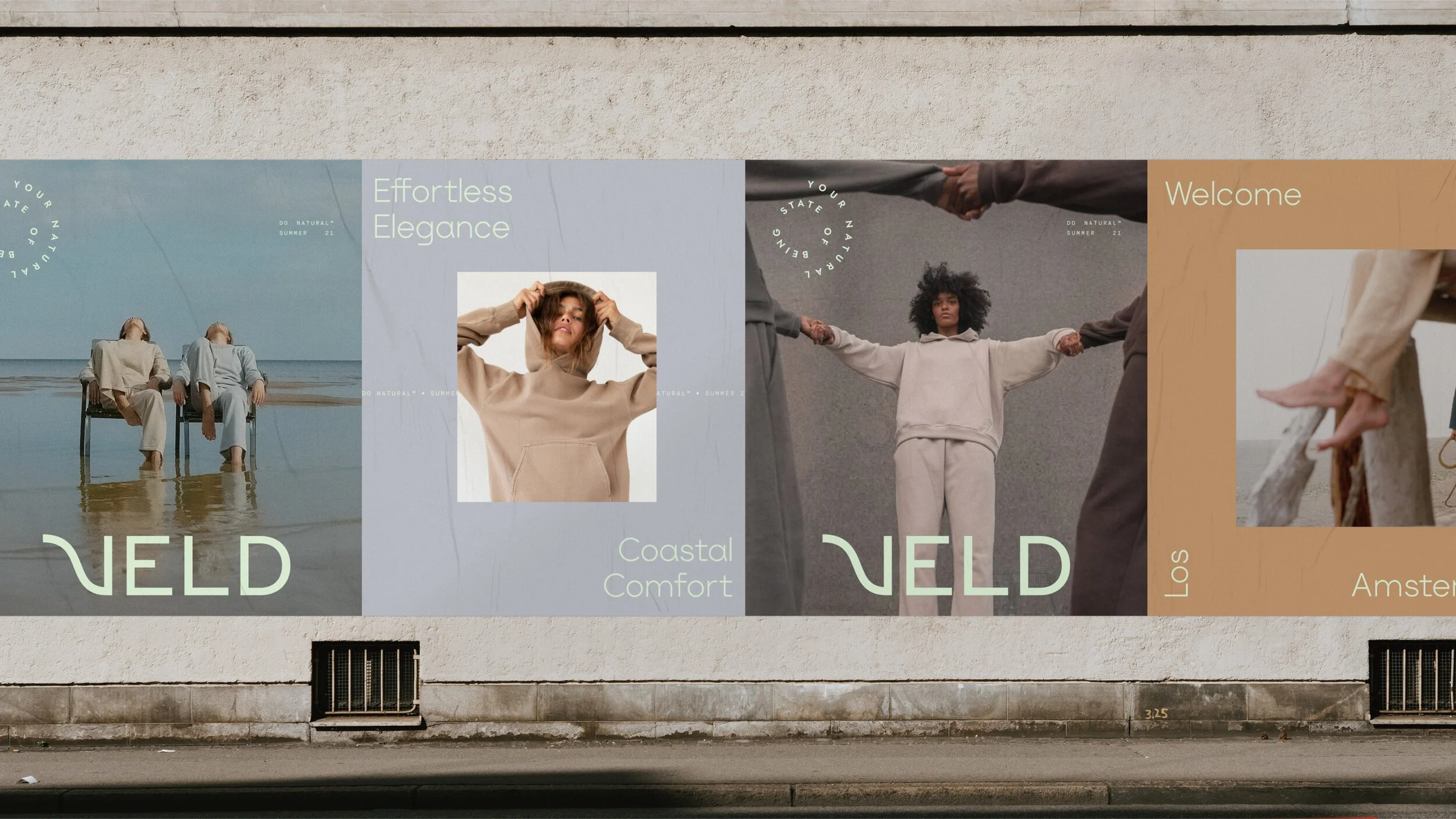
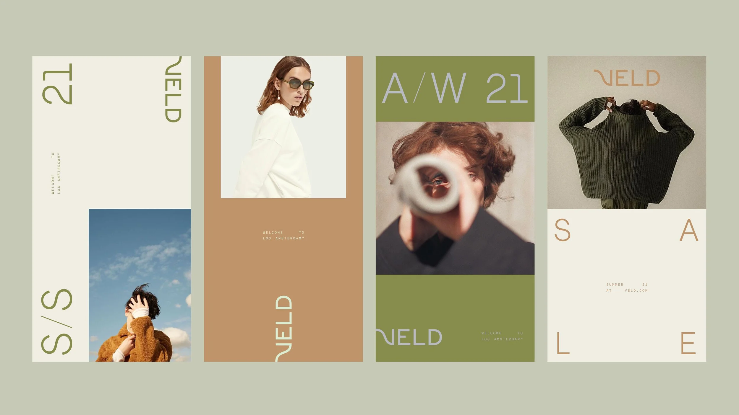
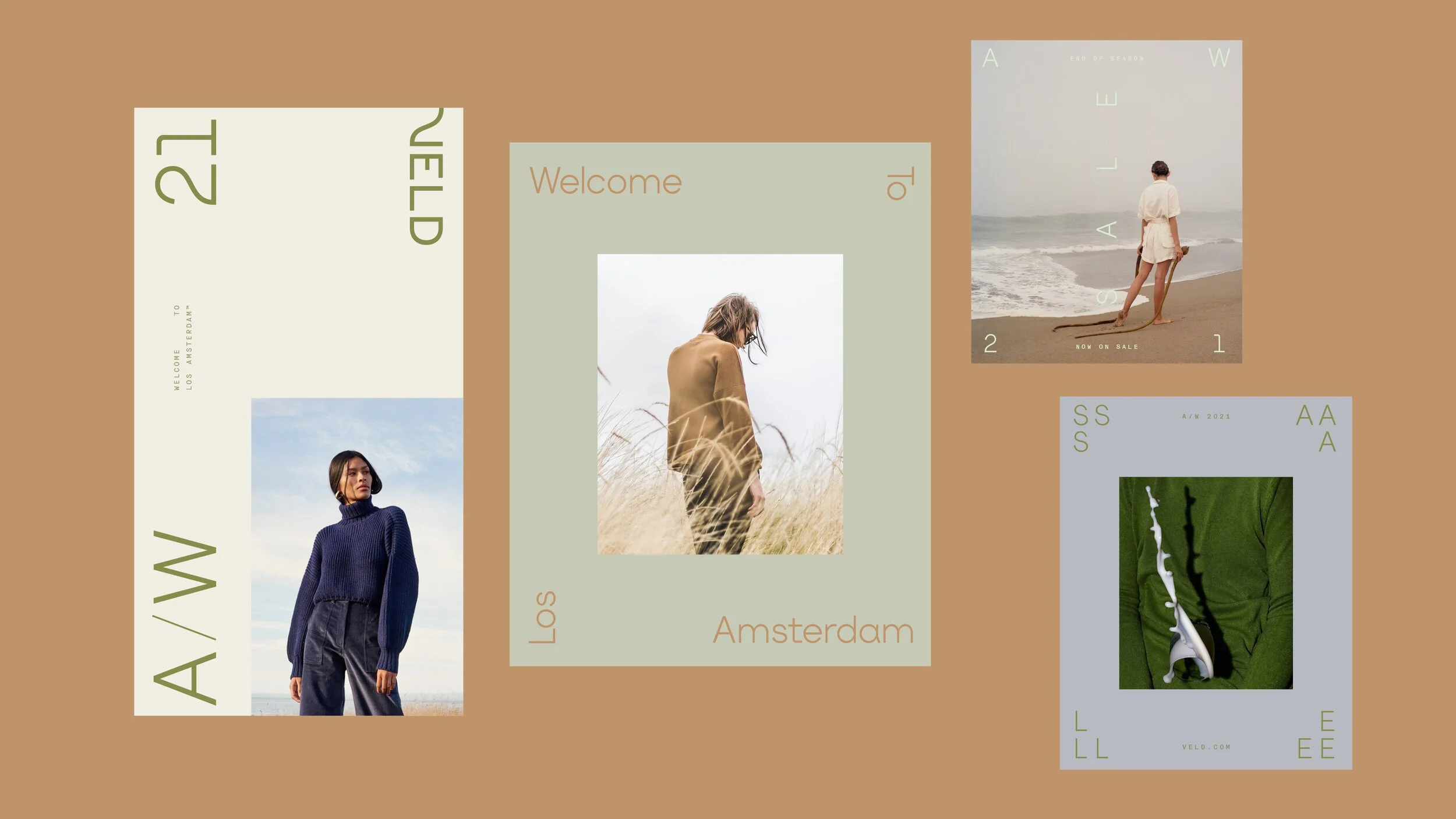
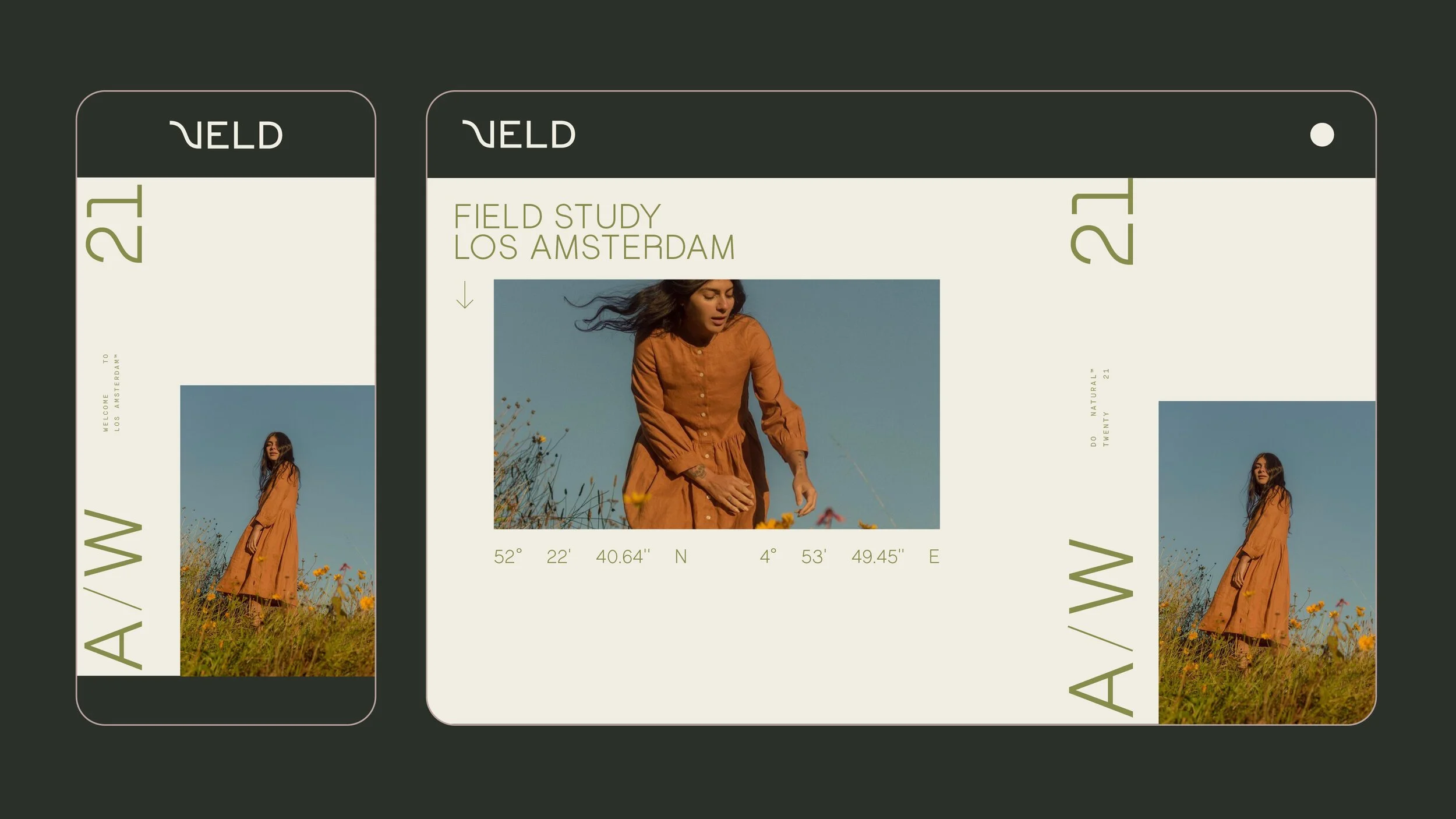
Brand Identity package for Veld, an Amsterdam based line of sustainable comfort wear launching Fall 2021.
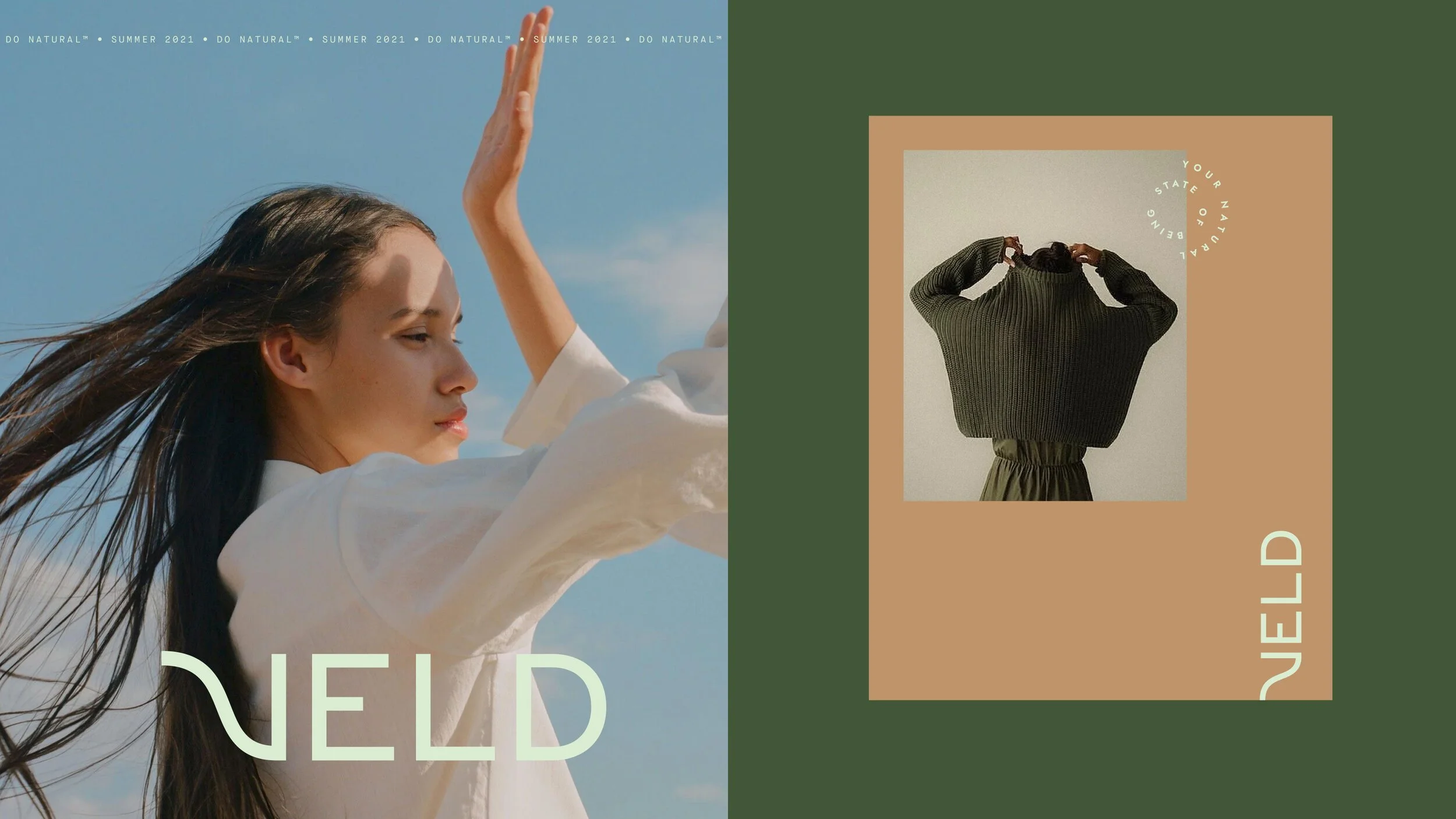
NATURAL EDGE
Veld means ‘Field’ in Dutch, and the brand wanted to contrast their soft natural fabrics and relaxed fits with a bit of ‘edge’ that aligned with the customer & company’s sensibilities, located primarily in Amsterdam, New York & Los Angeles.
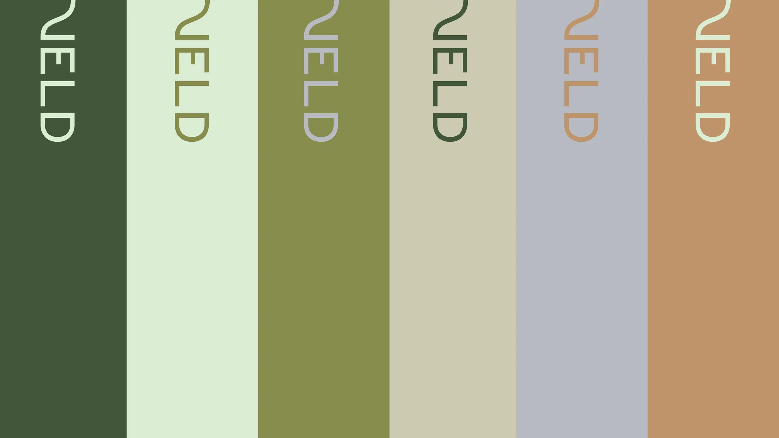
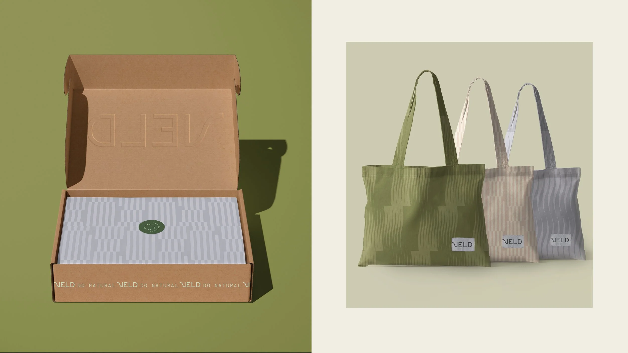
ORGANIC MEETS STRUCTURED
The breezy, laid back logo accompanies a natural color palette and a set of patterns that represent abstract interpretations of nature & fields.
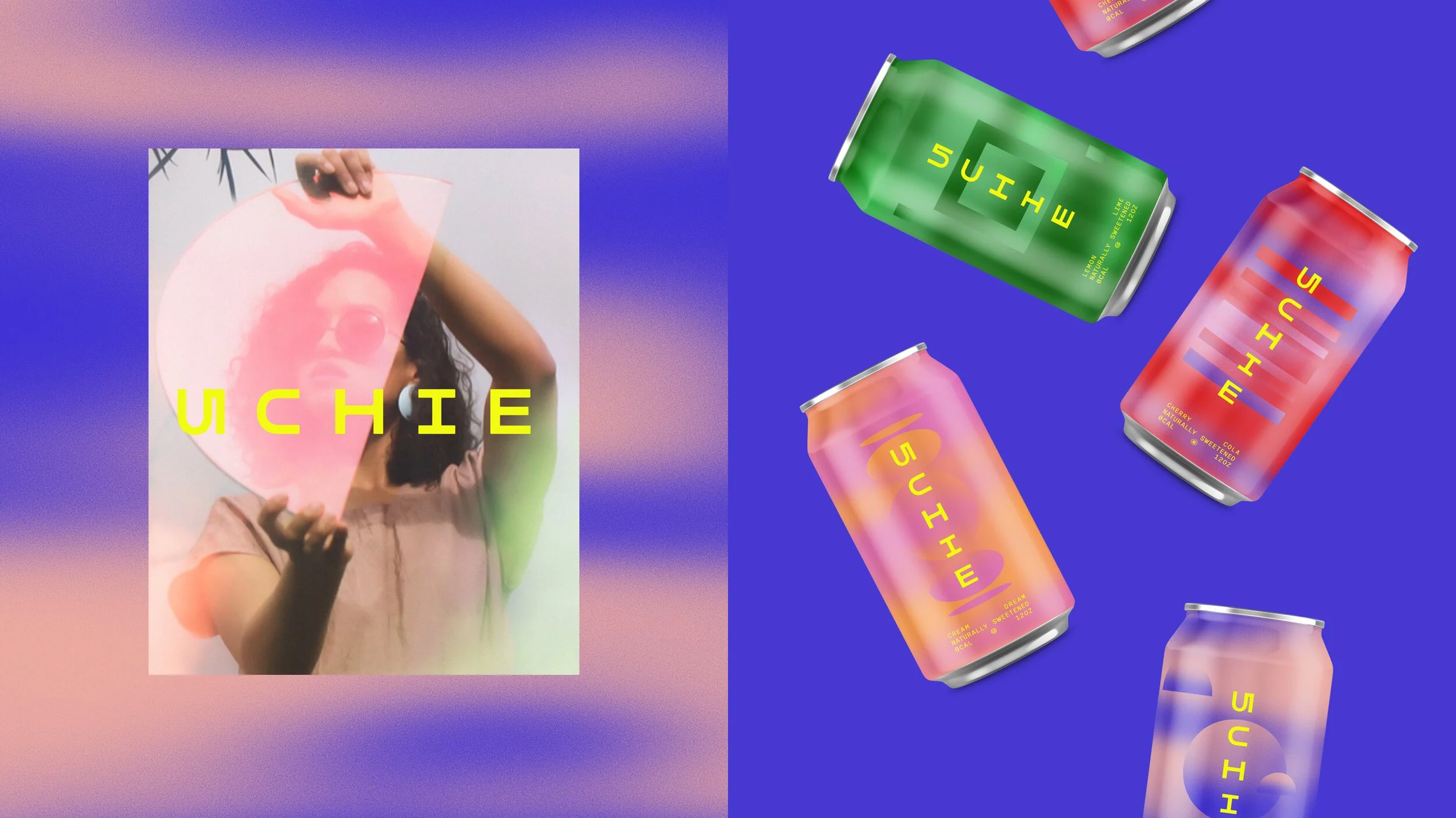
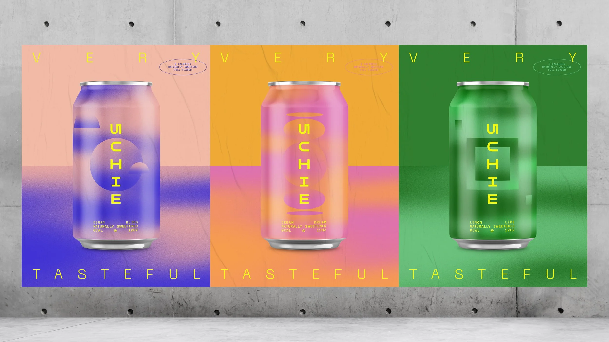
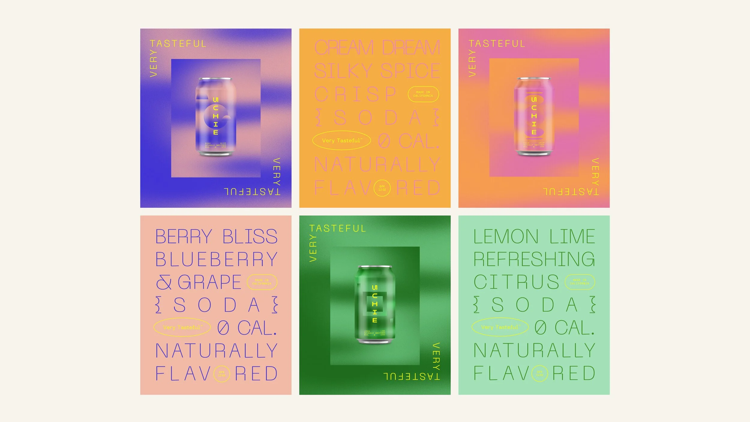
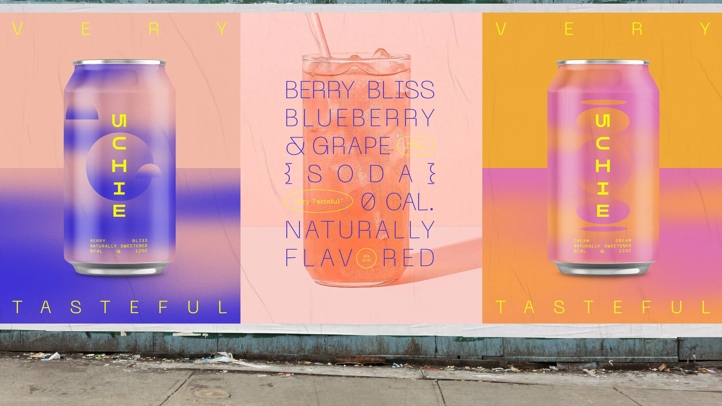
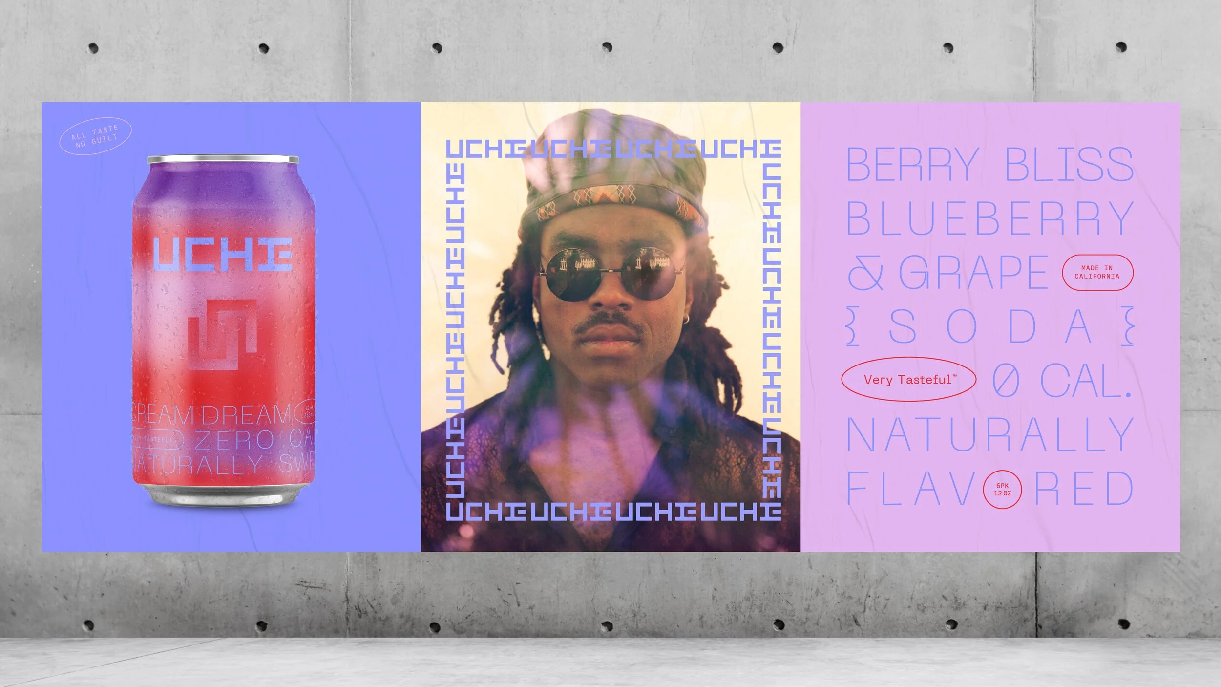
ART DIRECTION & DESIGN THINKING
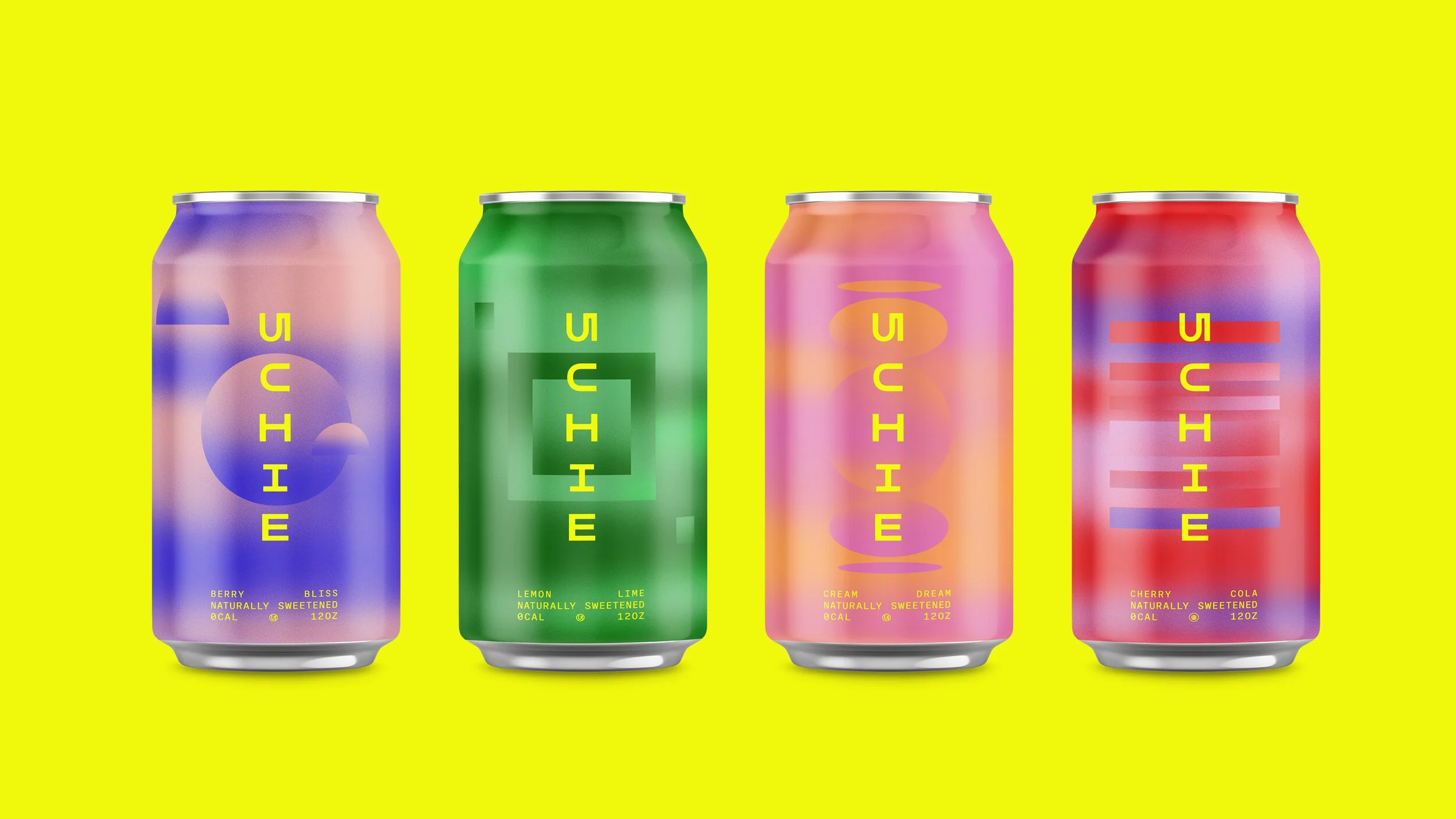
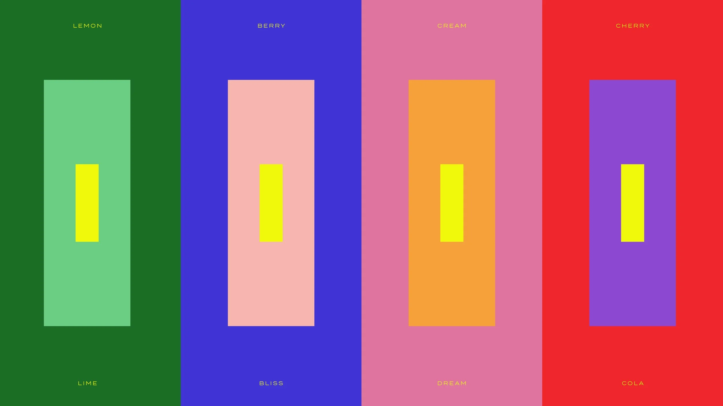
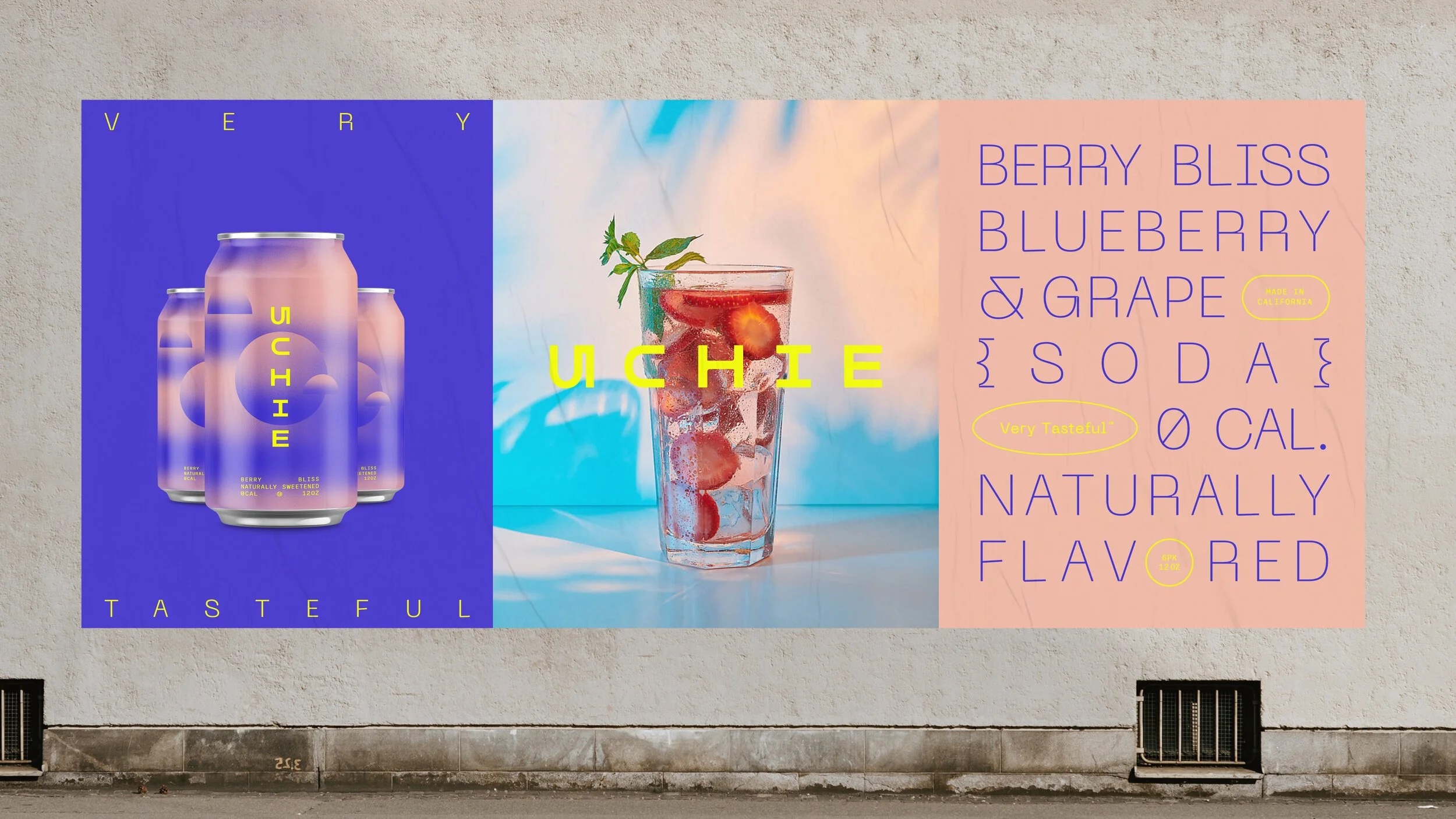
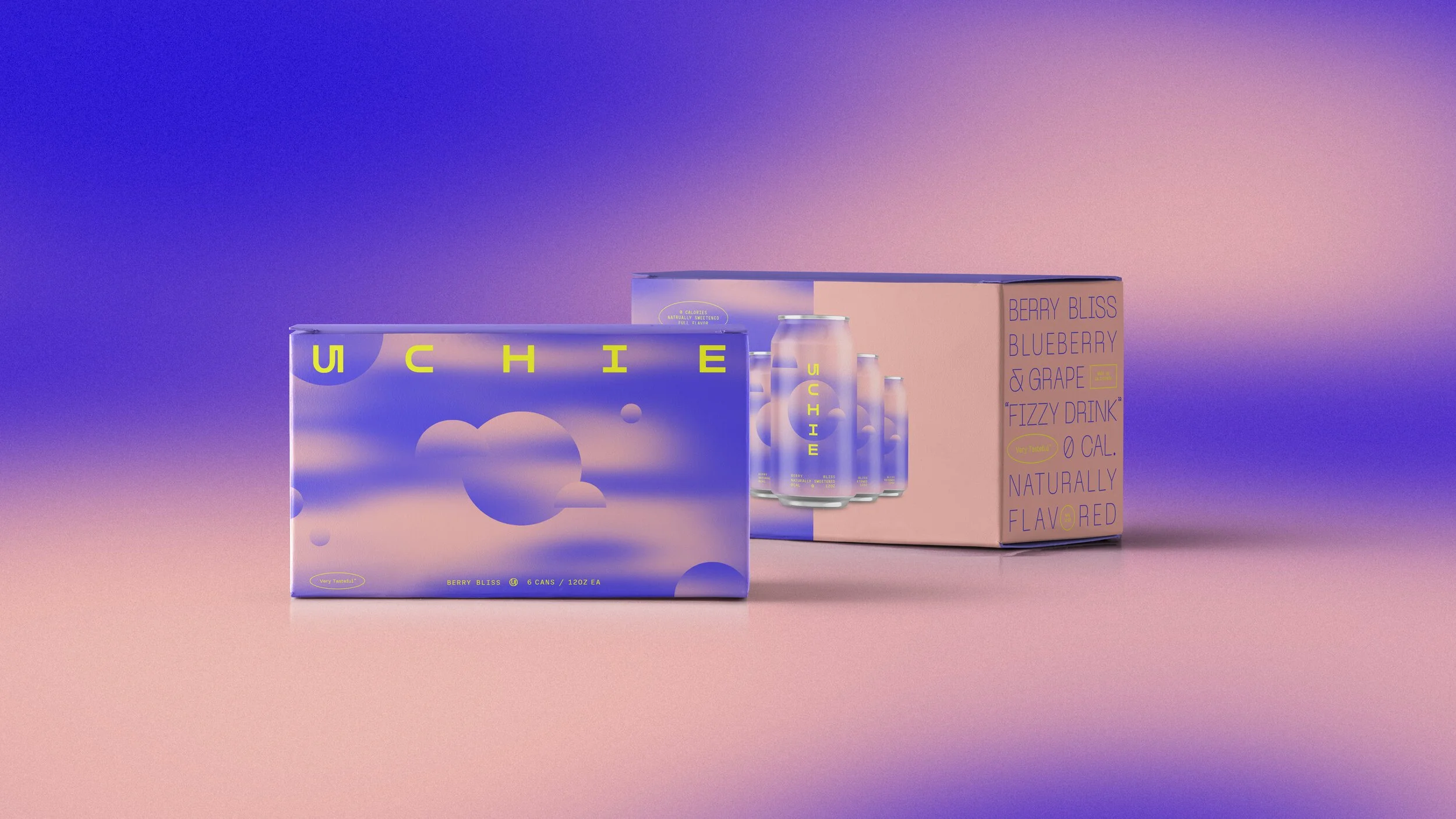
Brand concept for a new healthy line of seltzer sodas launching 2021. In the end, the client chose with another direction, but it was a blast to create.
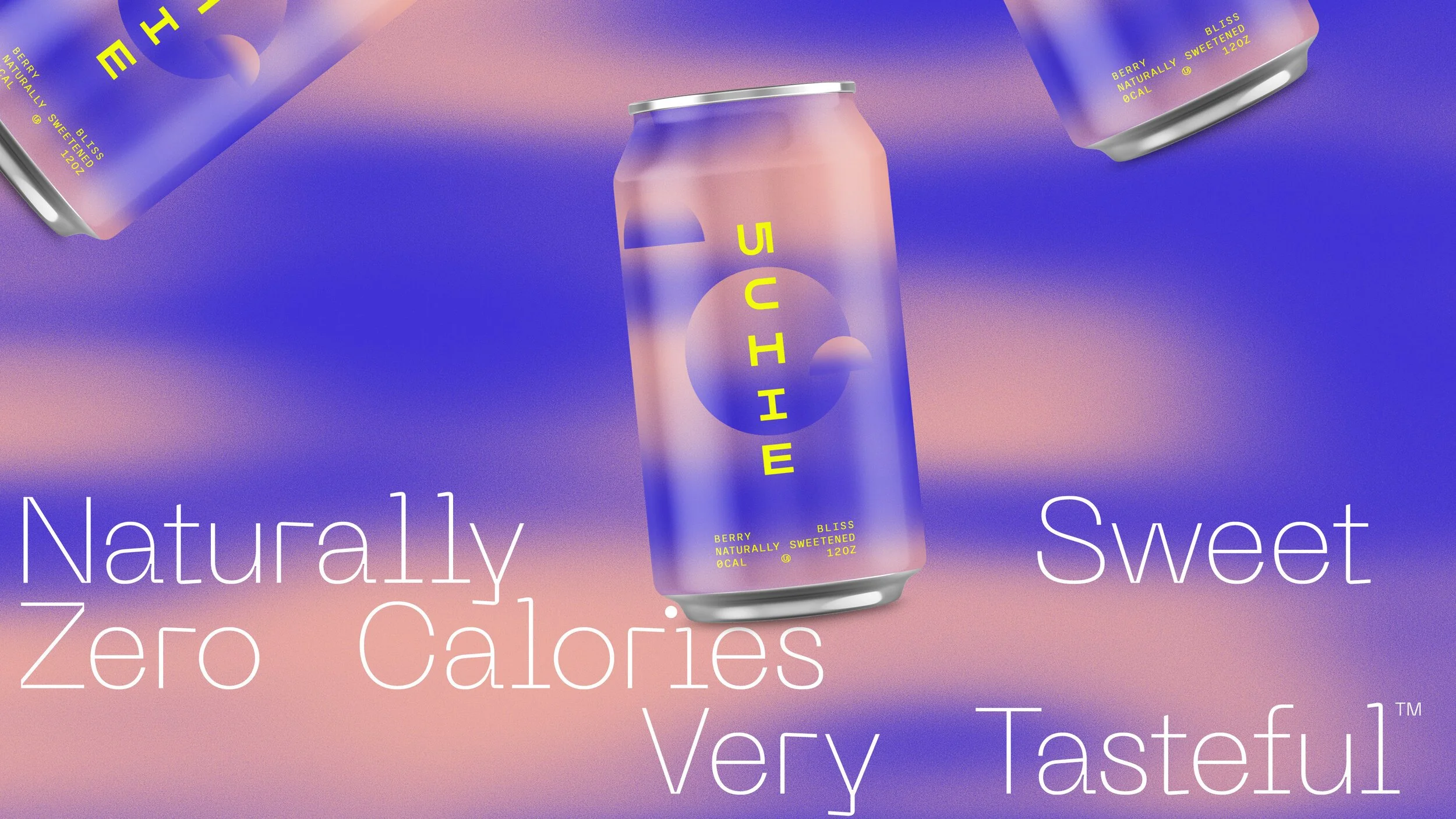
CHANGING PERSPECTIVES, ELEVATING A CATAGORY
Uchie’s founders loved the Light & Space movement and wanted the brand to feel playful yet tasteful. Like the artwork of the L&SM, taste is an experience, so the platform “Very Tasteful” distinguished & elevated the brand in a playful way, evoking a colorful and impactful experience that delights all the senses.
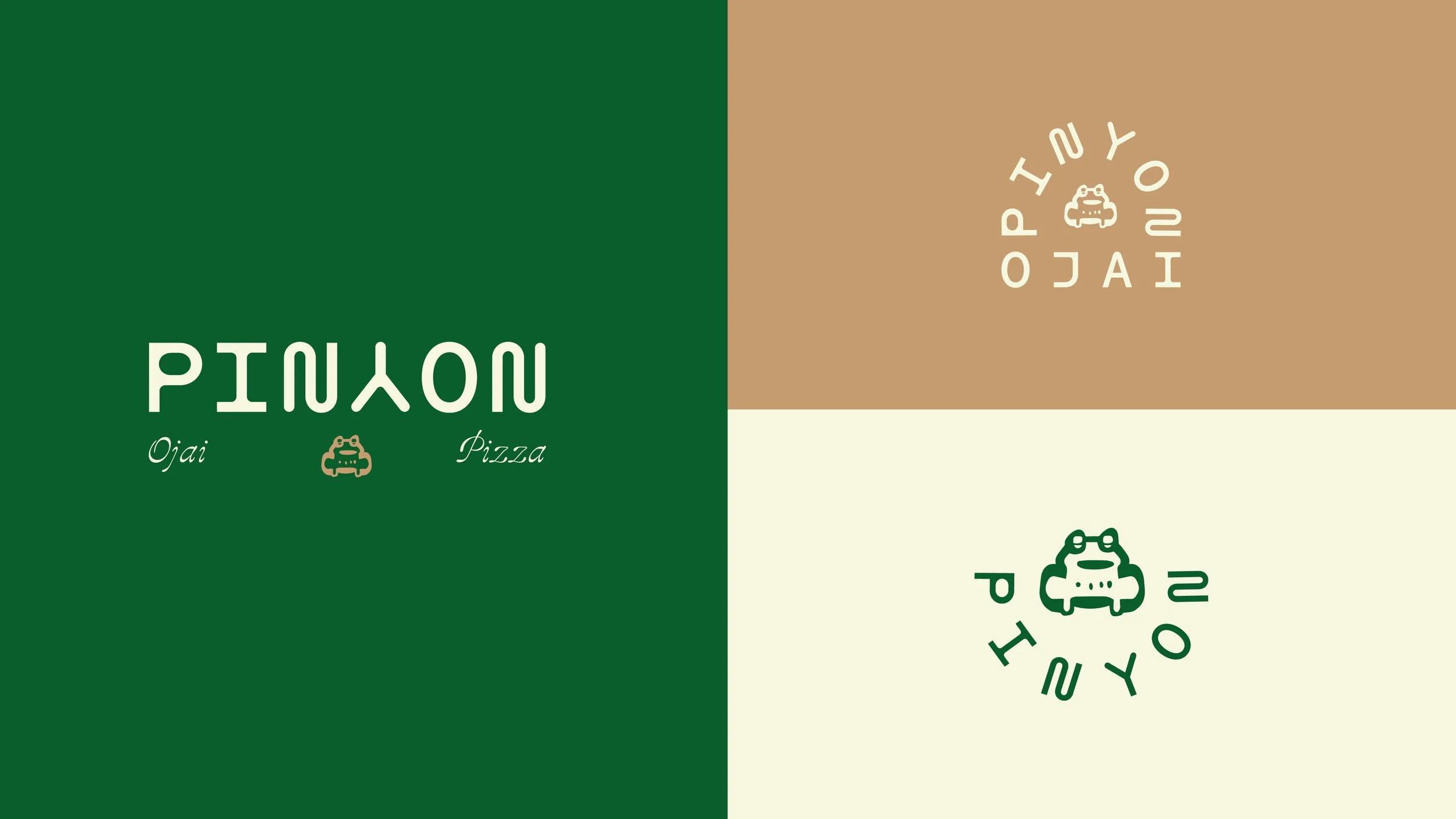
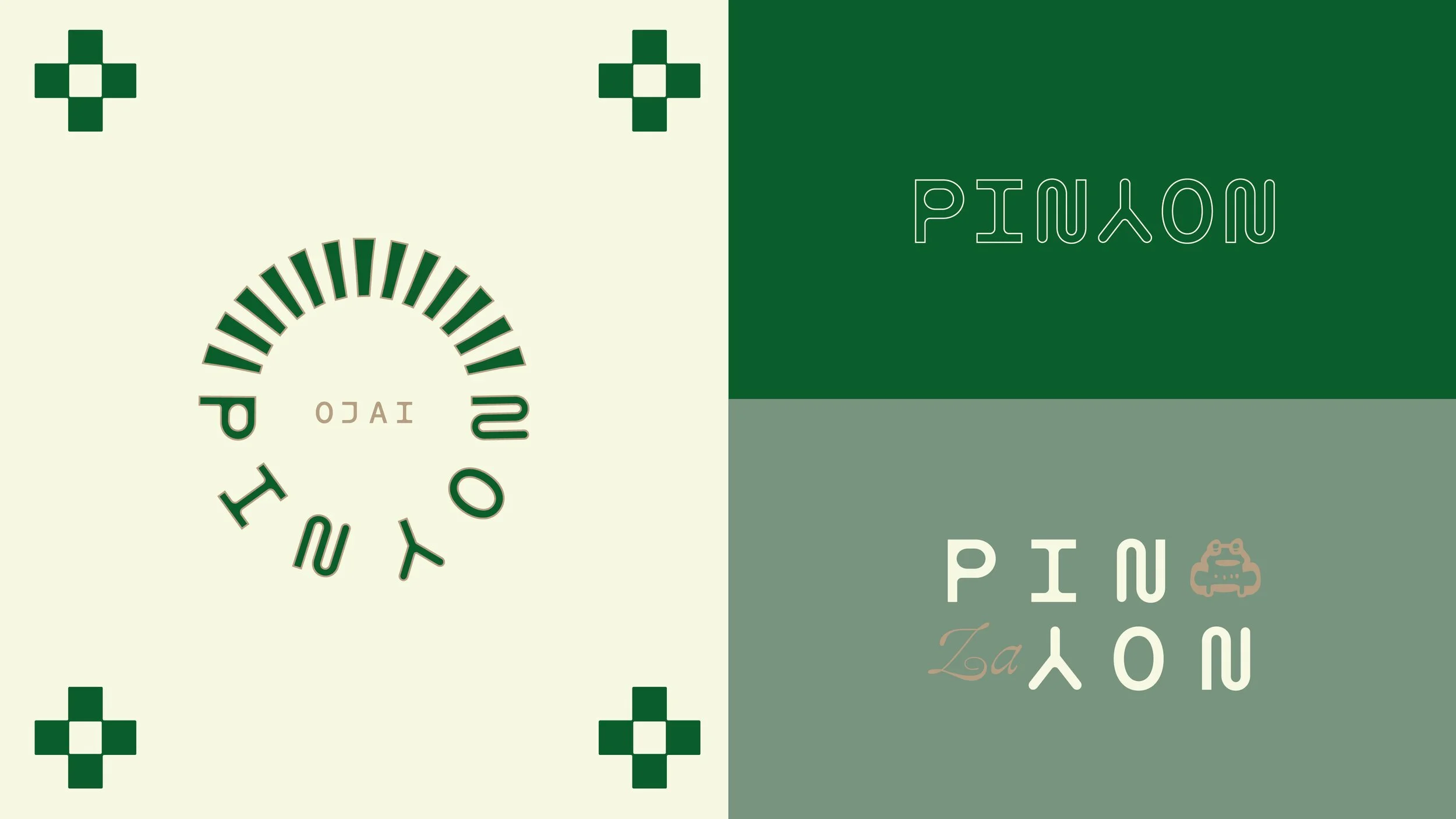
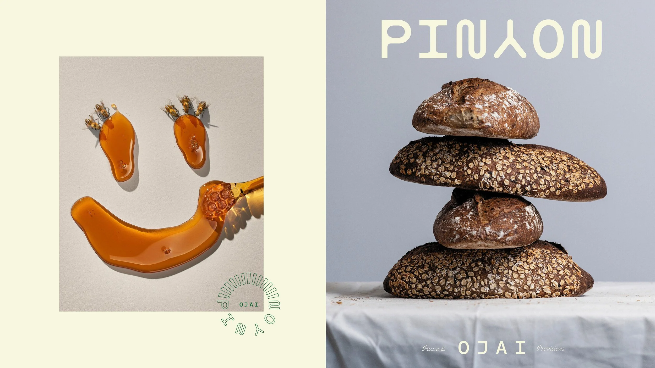
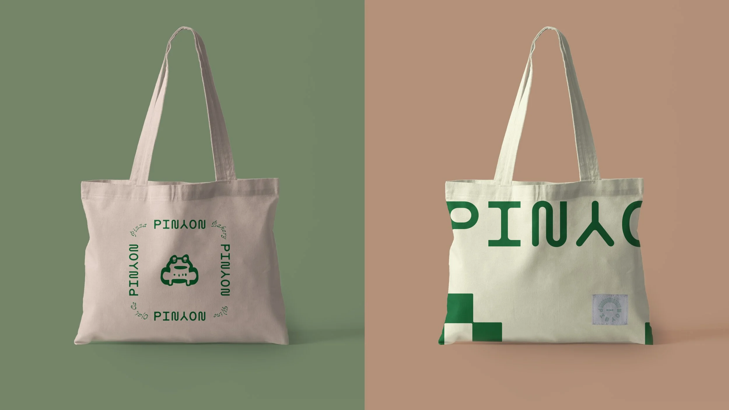
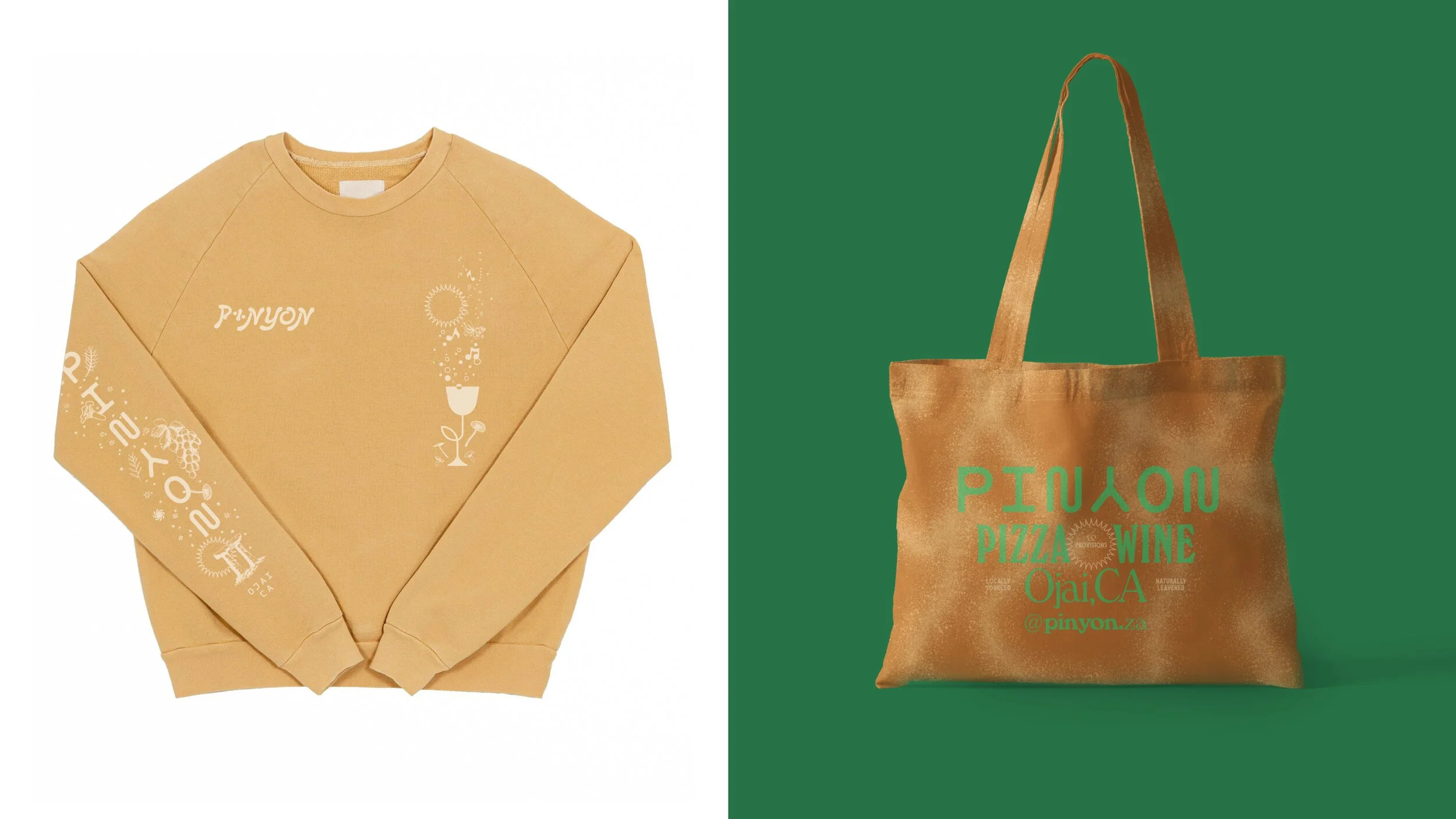
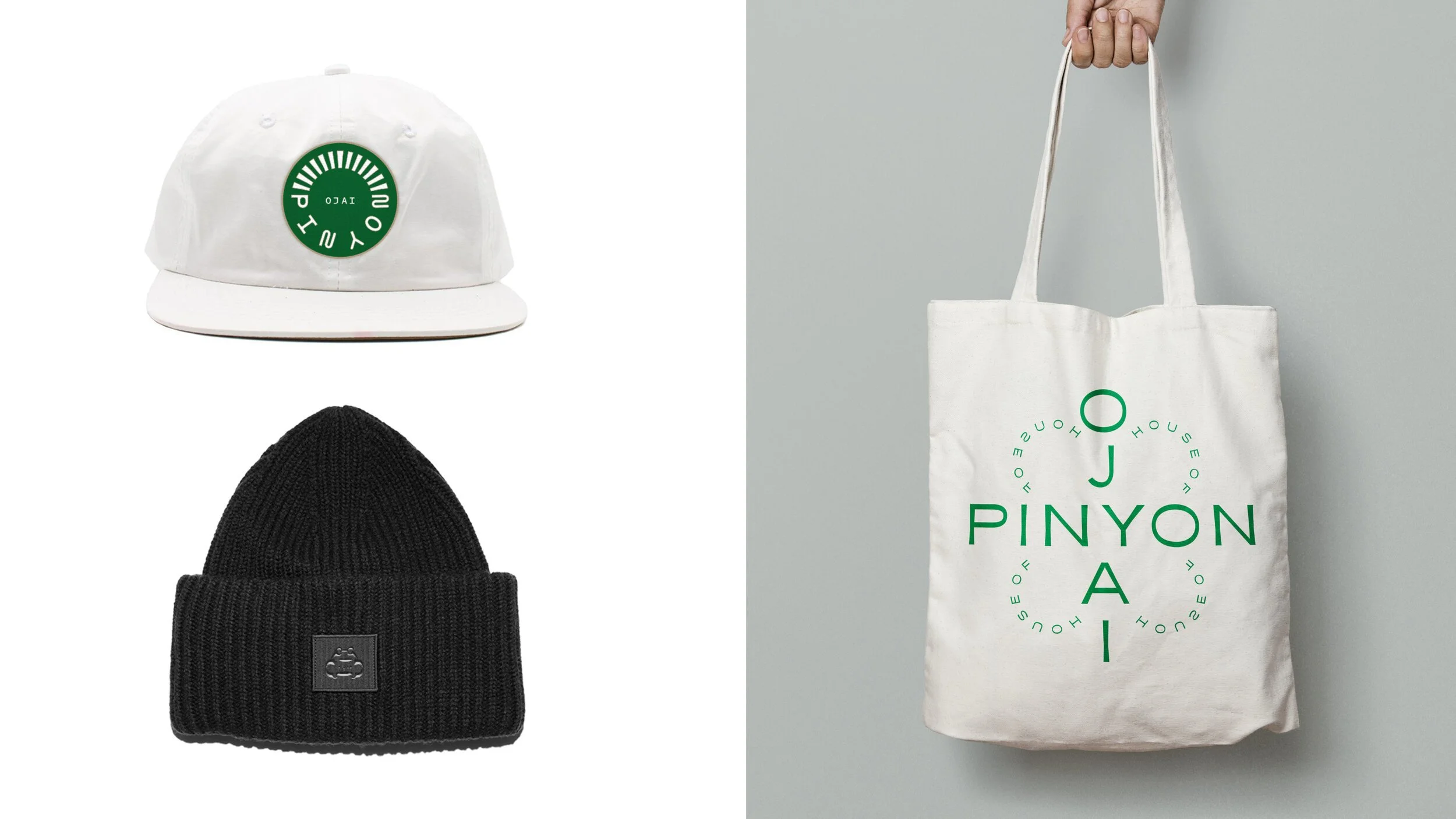
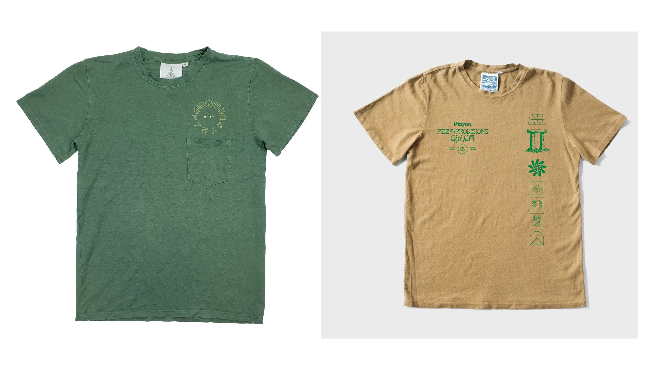
ART DIRECTION & DESIGN THINKING
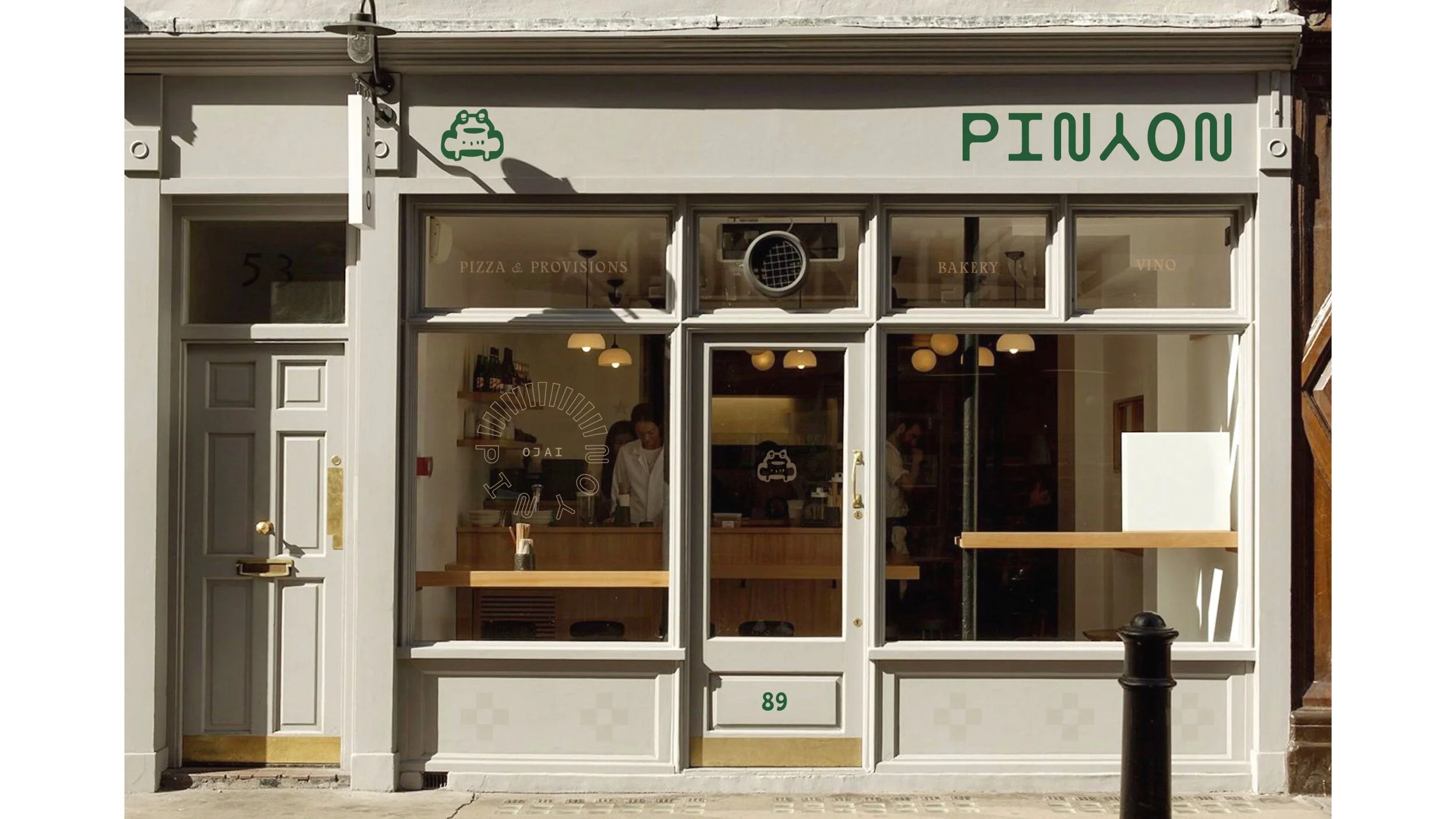
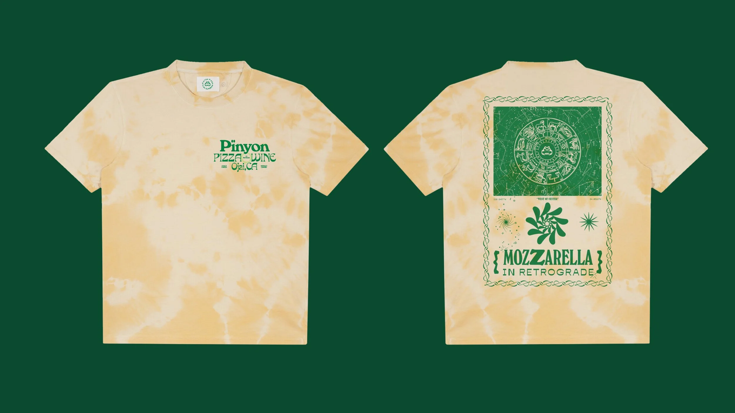
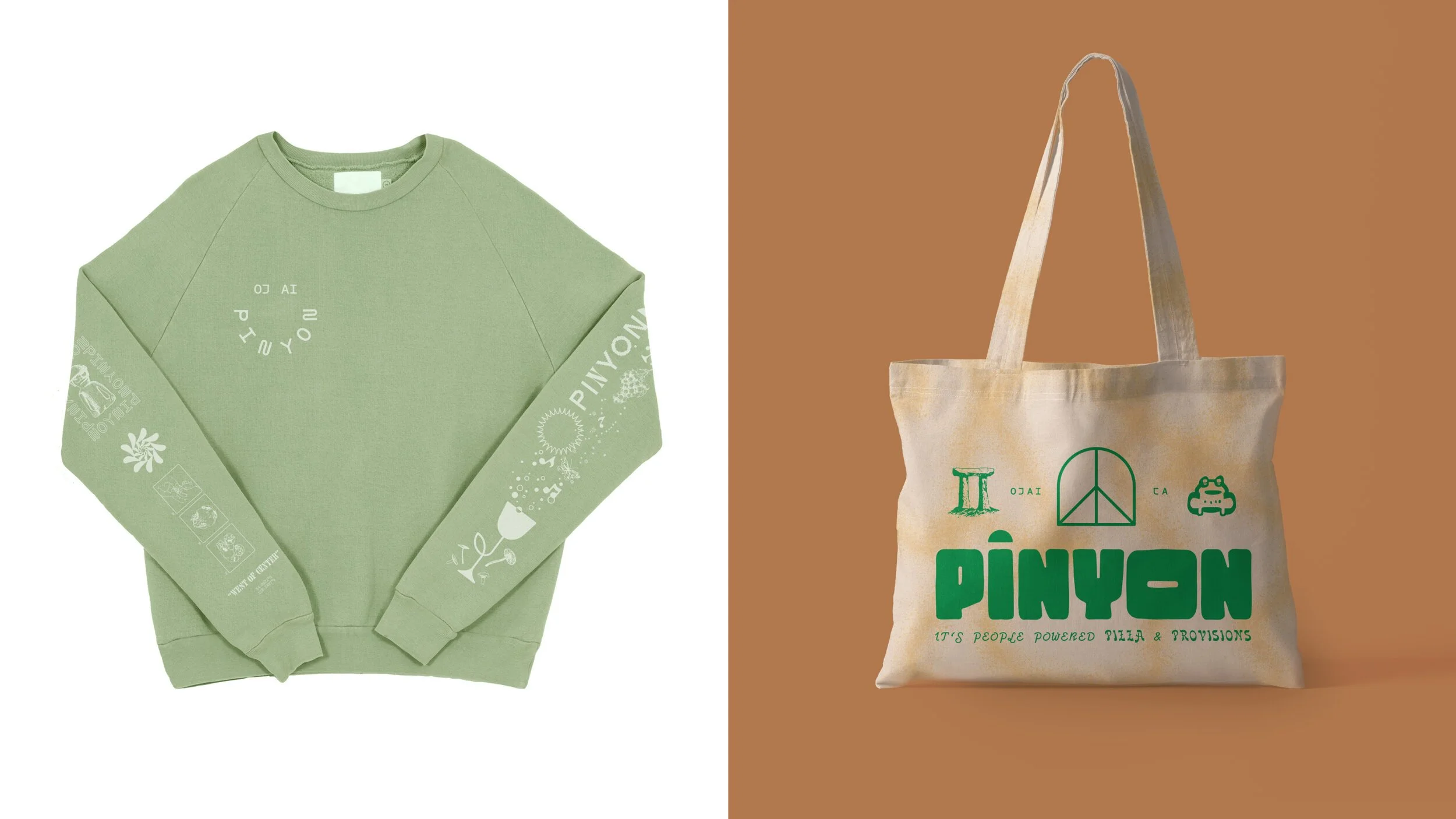
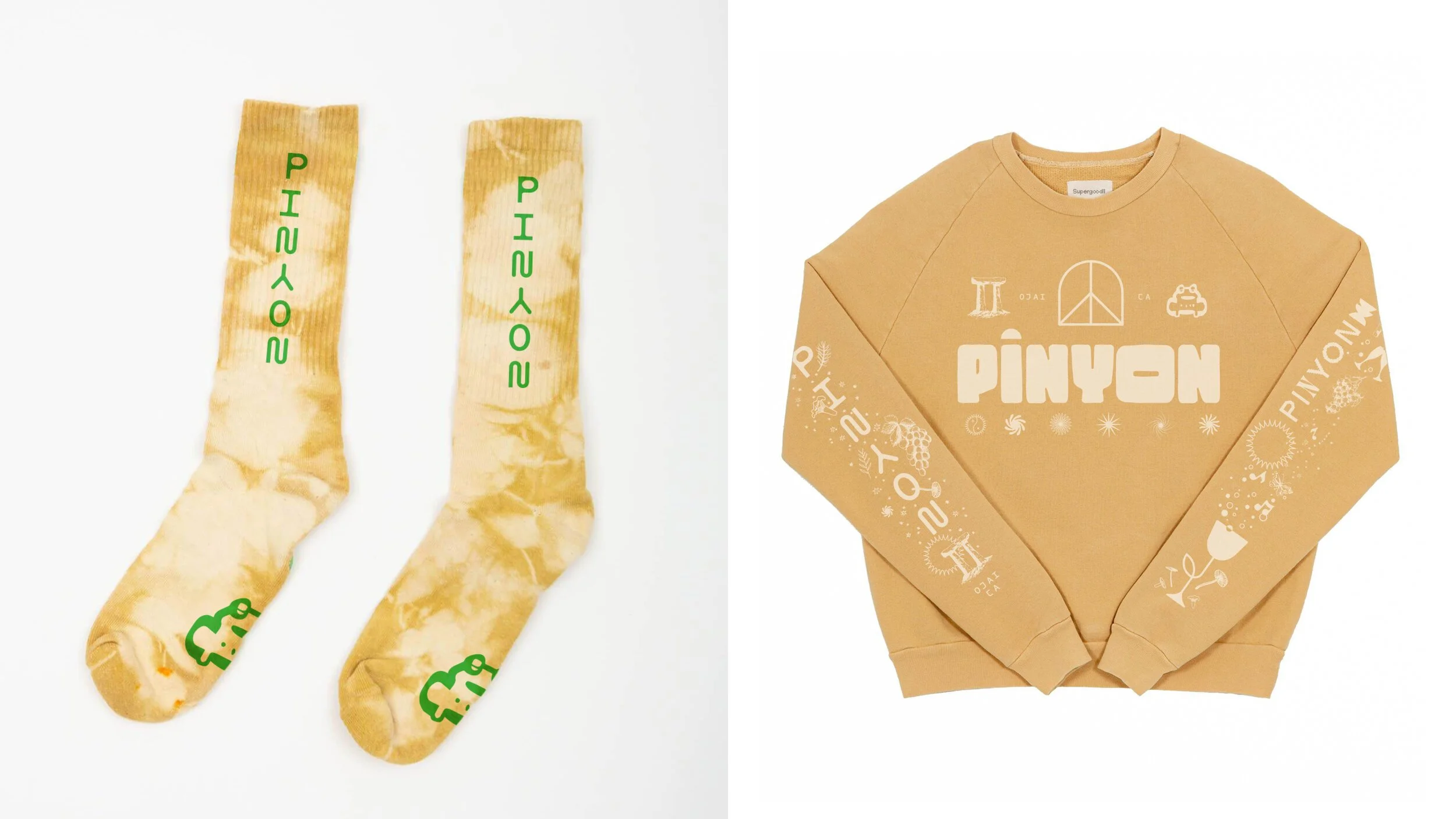
Brand Identity & collateral for Pinyon, a wood fired, worker owned, community minded restaurant in Ojai, CA.
ART DIRECTION & DESIGN THINKING